You are using an out of date browser. It may not display this or other websites correctly.
You should upgrade or use an alternative browser.
You should upgrade or use an alternative browser.
Hrmm are you assigning materials to your objects in blender? The FBX_MATERIAL is strange.when I export the trees as individual objects and import them, something goes wrong with their material -- any ideas what causes this?
View attachment 219477
Last edited:
Hrmm are you assigning materials to your objects in blender? The FBX_MATERIAL is strange.
Yea, so I made a new group for one tree with a material attached to it, and used that group as the source for the particle system. So in theory all those trees should have the same material. You can see some of them have the right material on them, but most of them don't, even though they're supposed to be all the same.
I know, but I can't even load a texture manually on those, it'll just stay "NULL" in AC.They should be using ksTree with AT blending mode, and ksAlphaRef set to about 0.5 (to allow shadows)
that does itAHA think I got it. They can't be linked multiuser objects. Select all and hit U and select object data then export and see how that works. Make sure the material name in editor matches what you have in blender.
Ok so my trees somehow still don't make use of the kstree shader feature. Here's what I'm trying:
1) set up y-tree with vertex normals facing up, call it KSTREE_PINE_TEST, put it in a group of its own
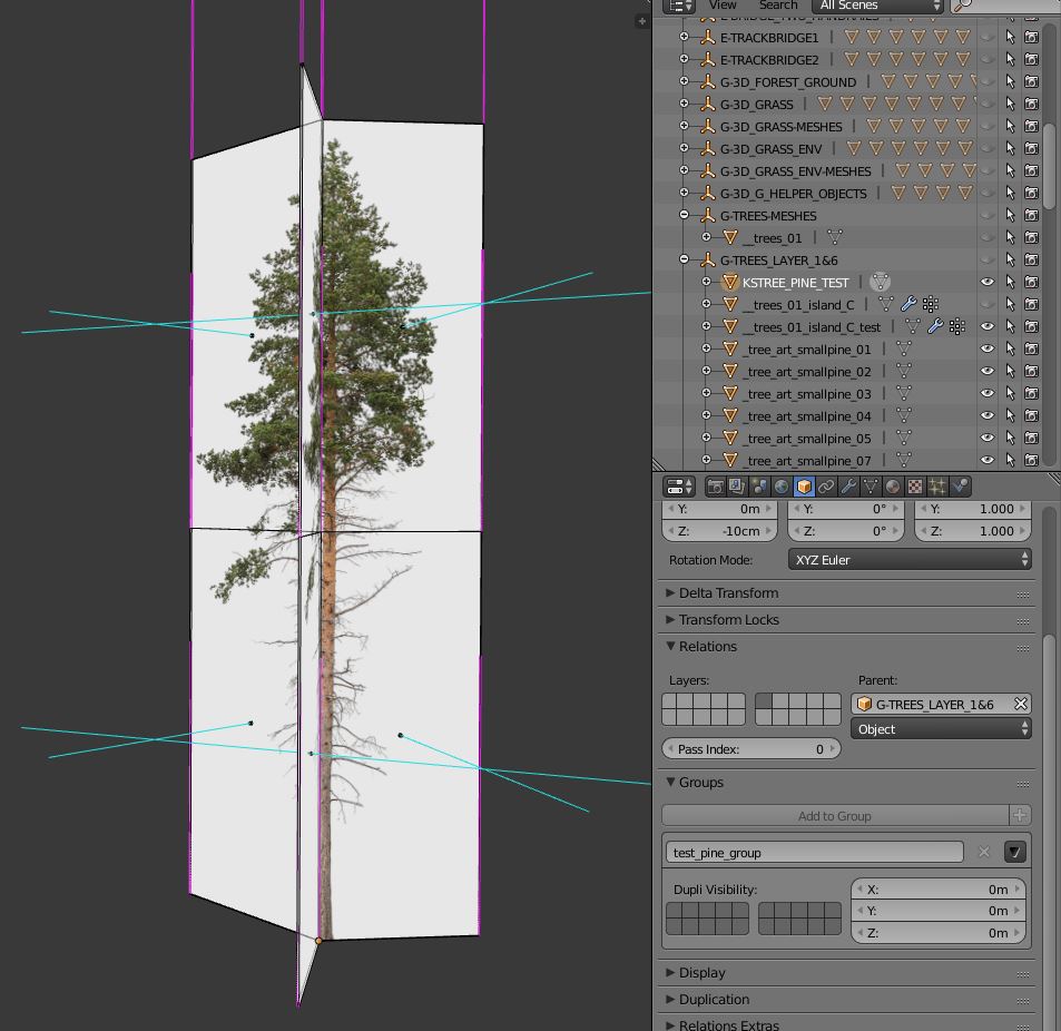
2) use particle system with said group as source

3) convert group, unlink trees, export as fbx

4) import to blender, use ksTree shader with 0.3 / 0.3 on the first 2, alpha = 0.6

And they are lit top to bottom, like the "TREE" in your example. What am I doing wrong?
1) set up y-tree with vertex normals facing up, call it KSTREE_PINE_TEST, put it in a group of its own
2) use particle system with said group as source
3) convert group, unlink trees, export as fbx
4) import to blender, use ksTree shader with 0.3 / 0.3 on the first 2, alpha = 0.6
And they are lit top to bottom, like the "TREE" in your example. What am I doing wrong?
So here's a comparison between using the KSTREE shader properly (1st image) and not doing so (2nd image). Each of them at three different times of day.


In principle I like the effect, but especially at noon (middle) the effect looks way overdone. Even in the evening it looks like this:

Have you guys experimented with setting the horizontal cut in the tree faces to different heights?
The next problem is that the tree walls that I place behind a few rows of trees don't have the same shader effect, which leads to the wall being clearly visible at times:

Here's another straight-on comparison of the two settings:


Suggestions?


In principle I like the effect, but especially at noon (middle) the effect looks way overdone. Even in the evening it looks like this:
Have you guys experimented with setting the horizontal cut in the tree faces to different heights?
The next problem is that the tree walls that I place behind a few rows of trees don't have the same shader effect, which leads to the wall being clearly visible at times:
Here's another straight-on comparison of the two settings:


Suggestions?
Well two things make sure the tree is sub-dived once on the vertical.
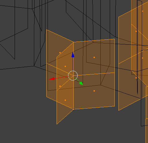
And also there should be some AO on the ground making it darker. Yes I am aware this is a different type of tree but same rules apply. There is no "shadow" shown here only AO under the trees.

And then for tree walls you need to a normal trick so they act the same way. You need the blend4web addon so you can edit the normals directly. This is how they should look.

And also there should be some AO on the ground making it darker. Yes I am aware this is a different type of tree but same rules apply. There is no "shadow" shown here only AO under the trees.
And then for tree walls you need to a normal trick so they act the same way. You need the blend4web addon so you can edit the normals directly. This is how they should look.
Last edited:
That thing I know!whats AO?
Ambient Occlusion
No idea what to do with it, but happy to supply the wording
Alright, so I see the idea behind the wall fix. Couldn't that also be my solution for the trees? As far as I understand the kstree shader overwrites the vertex normals in the trees so they all face up except the ones on the ground face down? Or where exactly do they face? Cause it feels like there should be a way of manually setting the vertex normals and placing the division in the tree faces in order to make my trees look right?
I use this technique on the right, which allows you to give the trees a more rounded feel than simple Y-trees, but uses fewer tris than an additional vertical segment on the left (18 tris vs 24tris - that soon adds up with 7-10k trees on a track).
Wherever you add the additional vert on the upright dictates where the 'underside' shading starts. It gives pretty much the same effect but is slightly more efficient I guess.
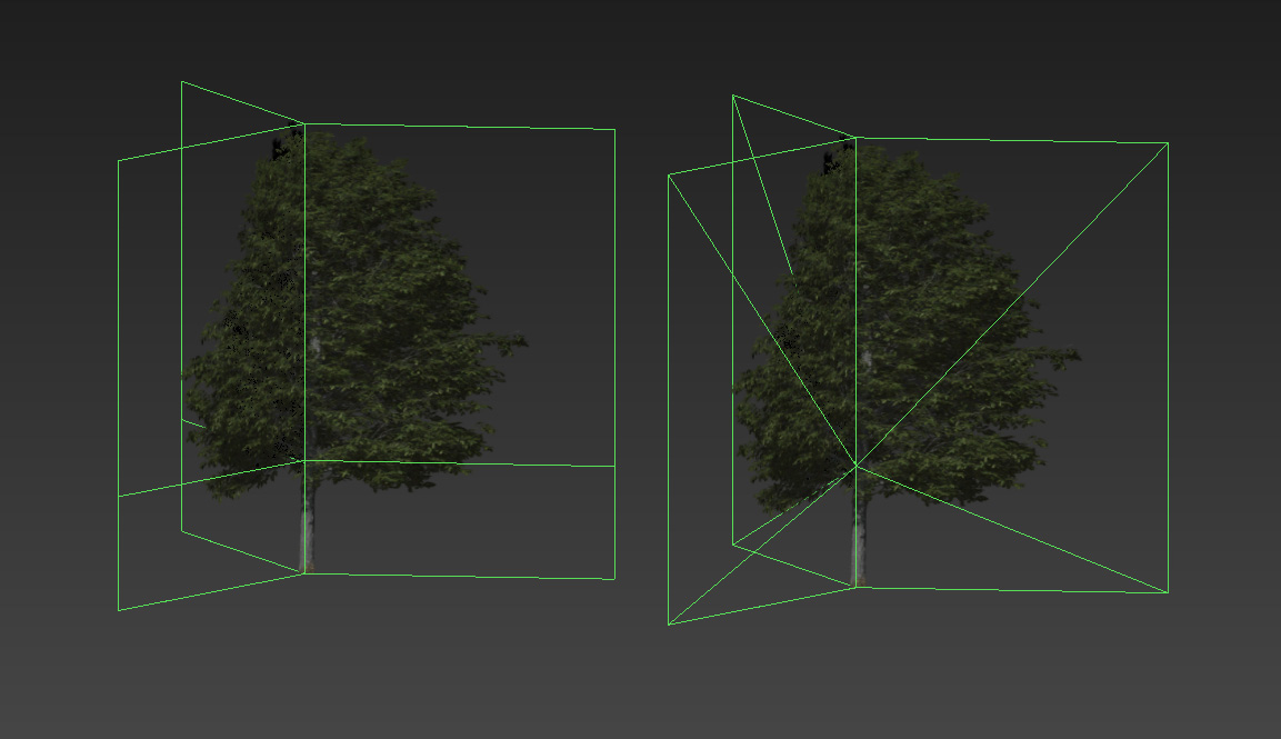
Wherever you add the additional vert on the upright dictates where the 'underside' shading starts. It gives pretty much the same effect but is slightly more efficient I guess.
Lol, I thought for a second on first glance that this is a real life photo
Introduction
Let's do some science...
Methods
3x3 experimental design + placebo

Results

1) So the kstree shader has two effects: (#1) darken the lower part of the tree with a smooth fade to the top ("shadow gradient"), and (#2) bringing some mostly horizontal brightness gradient to the tree to get rid of the flat look ("highlight gradient").
2) putting the origins below the faces gets rid of the shadow gradient altogether, but does not interfere with the highlight gradient (upper row).
3) putting the origins mid-tree doesn't change much vs. the bottom of the tree with respect to the shadow gradient (middle vs. lower row left+center), unless the origin is above the cut-line in the trees, then the tree gets all dark (middle vs. lower row right)
4) the height of the origin has an effect on the highlight gradient, as is evident by the very bright highlights in the bottom row, middle tree. there also seems to be an interaction with the cut-line, as the very bright highlight spot is only there for the front row middle tree, where the origin is very close to the cut-line.
Conclusion
While for the shadow gradient the upper end can be varied by varying the position of the cut-line, its strength (i.e. how dark the shadow gets) cannot be altered, since it always starts at 100% at the bottom of the tree.
Outlook
Next step will be to extend the tree a few meters into the ground and use a high cut-line to have a very long smooth shadow-effect gradient that should be at around 50% at ground-level.
edit
noticed something more about the highlight gradient, changed the post accordinly.
Let's do some science...
Methods
3x3 experimental design + placebo
Results
1) So the kstree shader has two effects: (#1) darken the lower part of the tree with a smooth fade to the top ("shadow gradient"), and (#2) bringing some mostly horizontal brightness gradient to the tree to get rid of the flat look ("highlight gradient").
2) putting the origins below the faces gets rid of the shadow gradient altogether, but does not interfere with the highlight gradient (upper row).
3) putting the origins mid-tree doesn't change much vs. the bottom of the tree with respect to the shadow gradient (middle vs. lower row left+center), unless the origin is above the cut-line in the trees, then the tree gets all dark (middle vs. lower row right)
4) the height of the origin has an effect on the highlight gradient, as is evident by the very bright highlights in the bottom row, middle tree. there also seems to be an interaction with the cut-line, as the very bright highlight spot is only there for the front row middle tree, where the origin is very close to the cut-line.
Conclusion
While for the shadow gradient the upper end can be varied by varying the position of the cut-line, its strength (i.e. how dark the shadow gets) cannot be altered, since it always starts at 100% at the bottom of the tree.
Outlook
Next step will be to extend the tree a few meters into the ground and use a high cut-line to have a very long smooth shadow-effect gradient that should be at around 50% at ground-level.
edit
noticed something more about the highlight gradient, changed the post accordinly.
Last edited:
New results are in...
Methods

Clarification: The front row is 6 trees with their origins roughly at ground-level. The rear row is 2 trees, duplicates of the rightmost 2 in the front row, but lowered origins.
Results
1)

The height of the origin does influence the highlight gradient (effect #2). I now assume that is more of a circular brightness gradient, and it is additive.
2)
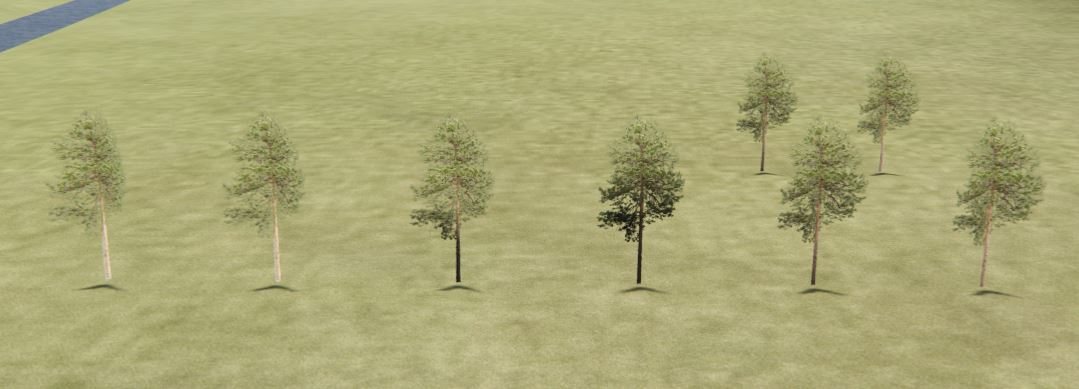 The origin does not influence the shadow gradient (effect #1). In the first row, the two trees on the right with their extended geometry seem to have less of the shadow gradient simply because it starts a few meters below ground-level. The lower it starts, the less we see of the effect.
Conclusion
The ksTree shader has two separate effects that separate it from the alpha-only shaders.
(#1) a shadow gradient (subtracting brightness) starting at the bottom of the tree's geometry, extending up to the horizontal cut-line in the tree. This affect appears to be linear and following a 1-dimensional gradient. This effect is absent if the trees origin lies below its geometry.
(#2) a highlight gradient (adding brightness) starting at the origin of the object and extending outward in a somewhat radial fashion. This effect increases as the origin moves up towards the cut-line, and decreases as the origin moves below the ground.
So what I'm gonna do is probably to go a middle way between the two rightmost trees in the front row, i.e., a roughly 10m extension below ground with origins at ground level.
Appendix
This is what it looks like from the underworld

edit
improved phrasing clarity, updated conclusion
Methods
Clarification: The front row is 6 trees with their origins roughly at ground-level. The rear row is 2 trees, duplicates of the rightmost 2 in the front row, but lowered origins.
Results
1)
The height of the origin does influence the highlight gradient (effect #2). I now assume that is more of a circular brightness gradient, and it is additive.
2)
Conclusion
The ksTree shader has two separate effects that separate it from the alpha-only shaders.
(#1) a shadow gradient (subtracting brightness) starting at the bottom of the tree's geometry, extending up to the horizontal cut-line in the tree. This affect appears to be linear and following a 1-dimensional gradient. This effect is absent if the trees origin lies below its geometry.
(#2) a highlight gradient (adding brightness) starting at the origin of the object and extending outward in a somewhat radial fashion. This effect increases as the origin moves up towards the cut-line, and decreases as the origin moves below the ground.
So what I'm gonna do is probably to go a middle way between the two rightmost trees in the front row, i.e., a roughly 10m extension below ground with origins at ground level.
Appendix
This is what it looks like from the underworld

edit
improved phrasing clarity, updated conclusion
Last edited:
Latest News
-
Sim Racing Black Friday Deals 2024Black Friday is nearly here, but a lot of Sim Racing's top brands and names have already started...
- Connor Minniss
- Updated:
- 8 min read
-
Racing Club Schedule: November 17 - 24A new week means a new set of events in our Racing Club. Here's what's on tap from November 17...
- Yannik Haustein
- Updated:
- 3 min read
-
Macau Grand Prix in Sim Racing: Deserving of More?This weekend is the Macau Grand Prix and whilst a shadow of its former self, this tight street...
- Angus Martin
- Updated:
- 3 min read
-
How One Announcement Quadrupled Forza Horizon 4's Player BaseIt is exactly one month until Forza Horizon 4 will no longer be available to purchase online...
- Angus Martin
- Updated:
- 2 min read
-
Assetto Corsa EVO New Car Configurator In The PipelineAfter this year's sim Racing Expo, the excitement around Assetto Corsa EVO has continued to...
- Connor Minniss
- Updated:
- 2 min read
-
Steering Wheel Showdown: Which Wheel Would You Like A Sim Racing Version Of?Sim racers have plenty of choice when it comes to hardware. There are a number of cool steering...
- Yannik Haustein
- Updated:
- 2 min read
-
Gran Turismo 7: Yamauchi Teases New Cars For Update 1.53It is that time again when Gran Turismo series producer Kazunori Yamauchi teases us with an...
- Luca Munro
- Updated:
- 5 min read


