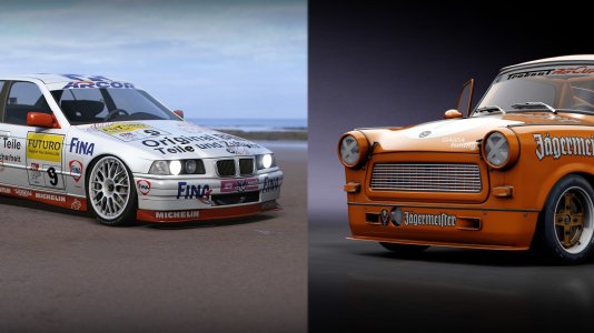
Can't wait to drift it 
You are using an out of date browser. It may not display this or other websites correctly.
You should upgrade or use an alternative browser.
You should upgrade or use an alternative browser.
Assetto Corsa | Share Your Screenshots
- Thread starter Bram Hengeveld
- Start date
Looks great!
Although i think the rear view mirror should reflect part of the car in that angle but i´d say they are well aware of that.
This is one of the cars i´m looking forward to the most, that and a Merc 190 Evo.
Although i think the rear view mirror should reflect part of the car in that angle but i´d say they are well aware of that.
This is one of the cars i´m looking forward to the most, that and a Merc 190 Evo.

Here's the original with much better image quality. The jpg (from facebook?) just eats up all the little details on the textures. I think you can see some very nice leathery texture on the materials in this pic.
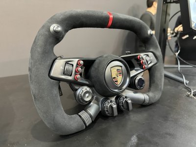
Also I dont think the shadows are bad. The only thing I see is that the shadow resolution in the lower pic seems to be smaller, but we dont know which graphic settings were used. Contrast seems totally fine due to the lower pic being a different time of day and inside a showroom. Solely the steeringwheel looks a little bit odd imo, kinda looks like its glowing a little bit...
Oops  And what a great image is that! Can´t wait to do some laps on the huayra .
I think this is one new screenshot we haven't seen before...
This one is from the latest interview (see the News thread)
credits: www.ilvideogioco.com

This one is from the latest interview (see the News thread)
credits: www.ilvideogioco.com

love dat stealth-colour!
It is soooo boring, its really stealth and what?
no it´s not stealth. Certain colors are associated with stealth appearance.
Greys, matt blackes, grey-blues etc.
Greys, matt blackes, grey-blues etc.
Latest News
-
RCTrophy Preview: Radio Controlled Simulation Taken To New Heights?An idea that started as a one-person operation to re-create treasured childhood memories has...
- Connor Minniss
- Updated:
- 2 min read
-
F1 24 Is Free To Play For The Las Vegas Grand Prix WeekendJust like its predecessor, F1 24 is free to play on the weekend of the Las Vegas Grand Prix...
- Yannik Haustein
- Updated:
- 2 min read
-
Need For Speed Unbound To Add Playable Motorbikes In Vol. 9Throughout the rich thirty-year history of Need For Speed, motorbikes have always evaded the...
- Connor Minniss
- Updated:
- 3 min read
-
Revisiting Our Top 3 2024 FIA WEC Moments in Le Mans UltimateThe 2024 FIA World Endurance Championship may be over but its intense action rests heavy on the...
- Angus Martin
- Updated:
- 6 min read
-
Community Question: Which Car Would You Like To See Brought To Assetto Corsa?Assetto Corsa is renowned for being the most versatile racing simulator on the market with...
- Connor Minniss
- Updated:
- 2 min read
-
"A Lifelong Dream": How OverTake Community Members Tackled The Mantorp 6 HoursSim racing can have a great sense of community. A handful of OverTake members took this one step...
- Yannik Haustein
- Updated:
- 6 min read
-
F1 Manager 2024: Pit Lane Starts & More New Features In Latest UpdateAs the Formula One season starts to draw to a close, F1 Manager 2024 has been hit with a big...
- Connor Minniss
- Updated:
- 2 min read


