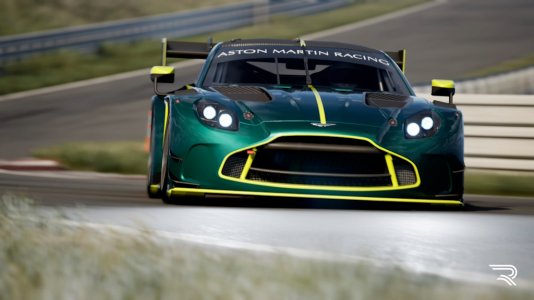
Cars Formula Hybrid 2018 by Race Sim Studio

Status
Not open for further replies.
Will have to wait to drive until tomorrow. In the mean time have been having a quick play with the template with a few ideas for my personal livery ;)

Still much more to do on it.

Just one question.. presumably I need to go into the 3D PS file to get the AO and UV layers for the hires logos texture as I can't see them anywhere else?
 
Just stunning... i see its gone quiet in here with everyone (presumably) lapping this beast. Looks amazing. Sounds great. Drives like a dream... I really don't know how to say it but its so drivable, There is moments going through corners that feel euphoric. Just mesmerizingly good :thumbsup: Thank You
 
Just stunning... i see its gone quiet in here with everyone (presumably) lapping this beast. Looks amazing. Sounds great. Drives like a dream... I really don't know how to say it but its so drivable, There is moments going through corners that feel euphoric. Just mesmerizingly good :thumbsup: Thank You

Tons of of downforce + tons of grip = Balls-out performance 100% of the time
 
wheel doesnt show lap battery limit or fuel?
Hi,
The 2018 Hybrid project is officially sponsored by Wave Italy SRL , using exclusive branding on all liveries,
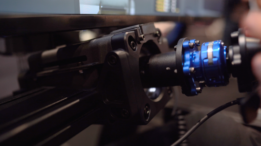
and using there Wave Impact F1 steering wheel in which is a officially licensed product soon available in there shop for purchase, we worked with there software manager to implement the best product possible,
we did add fuel and delta which as a + makes it more usable maybe we can dev the display more and work together to find a better solution :)
 
some color on the car
rss_formula_hybrid_2018.jpg
 
Looking good, try to improve the high res logo parts, as your logos on the high res all have a white border. Simply make an outline with 3px width or so in the RGB part of the texture and cut it with the alpha.
Leave the alpha channel text and do not leave the text in the diffuse make it 1 solid color a square around the text ,
causes zero issues and no stroke required :)
 
Like for example ,
the top layer the diffuse layer can be one solid color,
this 100% solid block will represent the "text" which gets highlighted by the alpha channel,
if you have text on this top layer then turn it off,
c4018f7fa700a60af5e673c011536c74.png

here is the alpha
3998f5da2b8130869ecb1cb943a32ac6.png

combined
49da689ec1e042bcbf211e20edbb3ff1.png

leaving text in both top and bottom layers will cause some unwanted side effects like the white ,
this way works best for solid text , if with stroke then maybe try Arnes techniques :)
 
Status
Not open for further replies.

Latest News

Do you prefer licensed hardware?

  • Yes for me it is vital

  • Yes, but only if it's a manufacturer I like

  • Yes, but only if the price is right

  • No, a generic wheel is fine

  • No, I would be ok with a replica


Results are only viewable after voting.
Back
Top