You are using an out of date browser. It may not display this or other websites correctly.
You should upgrade or use an alternative browser.
You should upgrade or use an alternative browser.
The "What Are You Working On?" Thread
- Thread starter garyjpaterson
- Start date
Getting close to unleash the beast. 
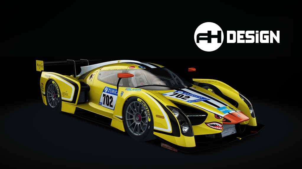
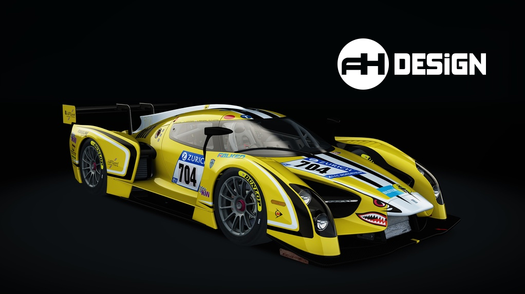
It's live!
Get your RAWR here: http://www.racedepartment.com/downloads/scg003c-nürburgring-24h-2017-traum-motorsport-2k-4k.15571/
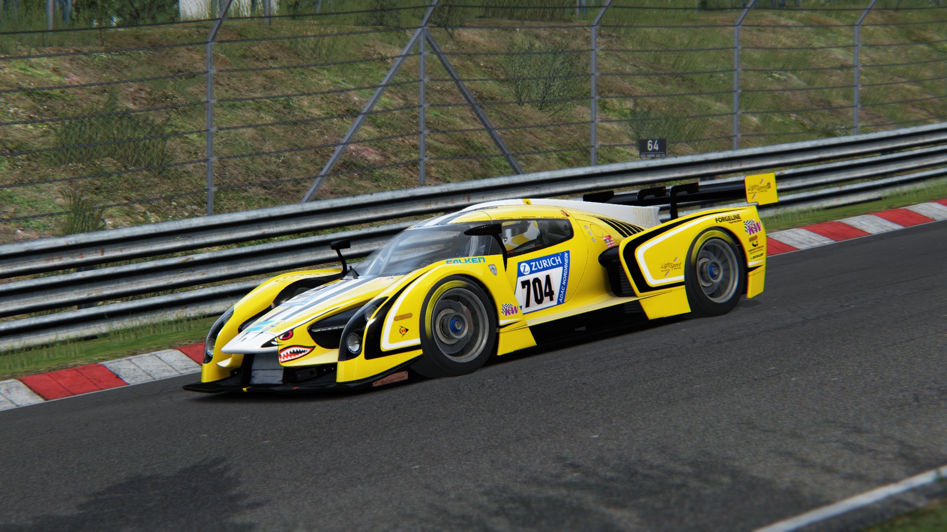
Get your RAWR here: http://www.racedepartment.com/downloads/scg003c-nürburgring-24h-2017-traum-motorsport-2k-4k.15571/
Brownninja97
Premium
Nice, from what ive seen alcantara is a damn hard thing to replicate nicely in games for whatever reason. Its shiny in pcars for some reason.
Nice, from what ive seen alcantara is a damn hard thing to replicate nicely in games for whatever reason. Its shiny in pcars for some reason.
Well mostly because it's hard to get it right using a tileable texture. The perfect solution would be to use a huge map (4k at least) and avoid using a tile, but that'll be overkill.
In this case I've used the NM_Detail shader as any other car, tried to get as close as possible without using too much tile or losing detail.
Still not perfect, but close. Haven't seen a good example of this in AC yet.
I hope they're not trade secrets because I've probably already looked at them in CM's showroom... and just about every other good looking mod 
What about using a small tileable detail texture for the grain, and then a larger texture (say, the whole dash as one non-tiling texture) for some colour/specular variation to make it look like the grain is brushed in a different direction? The change in look as the grain is brushed in a different direction is, to me, the biggest thing that makes Alcantara look like Alcantara.
Similarly to how the roads are textured.
Similarly to how the roads are textured.
What about using a small tileable detail texture for the grain, and then a larger texture (say, the whole dash as one non-tiling texture) for some colour/specular variation to make it look like the grain is brushed in a different direction? The change in look as the grain is brushed in a different direction is, to me, the biggest thing that makes Alcantara look like Alcantara.
Similarly to how the roads are textured.
That gave me an idea, so I messed with the map texture channels, added some variation to the AO, some adjustments to the shader, and I'm pleased with the result now, here it is:
My reference:
Might have to lose a bit of the contrast there but I think that does it.
No trade secrets here:
CM can show the shader settings?I hope they're not trade secrets because I've probably already looked at them in CM's showroom... and just about every other good looking mod
...wet Alcantara dreamsAlcantara dreams
View attachment 194372
Yup.CM can show the shader settings?

And that second go at the alcantara is phenomenal. Lovely stuff @A3DR.
that for sure makes things heaps easier, I knew it could show all textures and mappings, but that button I must have missed so far.
So I don't need to go down other paths anymore to analyse, nice
That gave me an idea, so I messed with the map texture channels, added some variation to the AO, some adjustments to the shader, and I'm pleased with the result now, here it is:
View attachment 194465
View attachment 194464
My reference:
View attachment 194466
Might have to lose a bit of the contrast there but I think that does it.
No trade secrets here:
View attachment 194468
Exactly what I was thinking. Beauty. Get the stitching on there and it'll be perfect.
Yep thanks for the tip that really helped! stitches you say?Exactly what I was thinking. Beauty. Get the stitching on there and it'll be perfect.Great stuff!
(another small experiment)
Latest News
-
Opinion: The Opportunity That ExoCross MissedExoCross - the futuristic interplanetary racing title published by iRacing seems to have been...
- Luca Munro
- Updated:
- 5 min read
-
Canada's New Rocky Mountain Motorsports Circuit Debuts In Assetto CorsaLocated just outside of Calgary, Alberta in Canada, Rocky Mountain Motorsports is a new circuit...
- Connor Minniss
- Updated:
- 3 min read
-
Japanese Drift Master: Full Release Delayed To Spring 2025Japanese Drift Master will not be ready in time for a 2024 release - developer Gaming Factory...
- Yannik Haustein
- Updated:
- 1 min read
-
Weekly Races & Twitch Broadcasts: Join The OverTake British GT4 League In ACC!Motorsport's real-world racing series are all winding down as 2024 enters the final stretch -...
- Yannik Haustein
- Updated:
- 2 min read
-
Attempting To Collect Assetto Corsa's Three Rarest Achivements In Three HoursAssetto Corsa is renowned for having over 700 achievements on Steam. The rarest ones have just a...
- Connor Minniss
- Updated:
- 5 min read
-
"Further Collaborations": What other Ferrari content could be headed to iRacing?Alongside the announcement of the Ferrari 499P getting added to iRacing in December, there was a...
- Luca Munro
- Updated:
- 7 min read
-
5 Things RaceRoom Needs To Be The Ultimate DTM SimWith its latest updates and content, RaceRoom has seen renewed interest among some sim racers -...
- Yannik Haustein
- Updated:
- 5 min read


