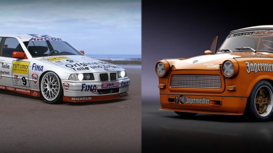
Well, it was my idea to do it, I might aswell release itBut can I release it? Your choice. Remember to give me your cars before I release it!
You are using an out of date browser. It may not display this or other websites correctly.
You should upgrade or use an alternative browser.
You should upgrade or use an alternative browser.
The W.I.P Thread
- Thread starter Thimoty Decrans
- Start date
D
Deleted member 161052
-
Deleted member 161052
Okay.Well, it was my idea to do it, I might aswell release itI did more cars too

D
Deleted member 161052
-
Deleted member 161052
a test-out with the loading screen for the Super GT mod...

D
Deleted member 161052
-
Deleted member 161052
re-scaled the showroom floor so all drivers can be viewed


D
Deleted member 161052
-
Deleted member 161052
all the 1992 CarSet in-game screenshots so far! For graphical viewing only.


D
Deleted member 161052
-
Deleted member 161052
and 1 more...

I said I will make renders !all the 1992 CarSet in-game screenshots so far!
View attachment 55664 View attachment 55665 View attachment 55666 View attachment 55667 View attachment 55668 View attachment 55669 View attachment 55670 View attachment 55671 View attachment 55672 View attachment 55673
Anyone knows a good setup for a render?
D
Deleted member 161052
-
Deleted member 161052
I know, but these are just for graphical viewing.I said I will make renders !
D
Deleted member 161052
-
Deleted member 161052
Here's 2014ver of the loading screen.

D
Deleted member 161052
-
Deleted member 161052
extra icon

Some logos are too shiny. You might want to fix the specocc.all the 1992 CarSet in-game screenshots so far! For graphical viewing only.
View attachment 55664 View attachment 55665 View attachment 55666 View attachment 55667 View attachment 55668 View attachment 55669 View attachment 55670 View attachment 55671 View attachment 55672 View attachment 55673
He knows good settings but I wouldn't call his renders realistic and I don't really like his style of renders. He makes them too dark and he gives paint effect to the treads while it shouldn't have paint effect. Too unrealistic. A render should be clearly visible , not dark like a black hole lol.
From what I know, the specocc is blank.Some logos are too shiny. You might want to fix the specocc.
He knows good settings but I wouldn't call his renders realistic and I don't really like his style of renders. He makes them too dark and he gives paint effect to the treads while it shouldn't have paint effect. Too unrealistic. A render should be clearly visible , not dark like a black hole lol.
Except the Jordan... Looks like darkening the white wasn't enough...
Do you know any better settings for a render?
Set it to paint effect and if you're not satisfied with it or you find it too shiny in the renders just reduce the refraction index. Also if you adjusting the brightness and contrast is a important aspect of a good render.From what I know, the specocc is blank.
Except the Jordan... Looks like darkening the white wasn't enough...
Do you know any better settings for a render?Trying to get the reflection on the car for a while now...
For f1 2012 you shouldn't really use full white color for logos or for paint because the game will make it brighter. Just make it even darker white.
Tnx mate! I can start doing my renders nowSet it to paint effect and if you're not satisfied with it or you find it too shiny in the renders just reduce the refraction index. Also if you adjusting the brightness and contrast is a important aspect of a good render.
For f1 2012 you shouldn't really use full white color for logos or for paint because the game will make it brighter. Just make it even darker white.
Just apply a simple color for environment instead of the default one. Environment plays a big role in the reflection so you must change that too.Tried to stick to a more bright version, but can't seem to get floor reflections on a bright version...
View attachment 55690
Any feedback?
Like this?Just apply a simple color for environment instead of the default one. Environment plays a big role in the reflection so you must change that too.
It has a bit of reflection
EDIT: Why am I doing a full render all the time?
This one seems a bit more realistic
Yeah, sometimes taking a snapshot actually look better as said by ML than a full render. But it looks uglier for you because you didn't let the Keyshot to finish loading the car fully. You can see the black points on the car clearlyLike this?
View attachment 55693
It has a bit of reflection
EDIT: Why am I doing a full render all the time?
This one seems a bit more realistic
View attachment 55694
And be sure to decrease the refraction index of the texture file under the materials tab (of course you can only do that if you have applied the paint effect on the texture).
Like this?
View attachment 55693
It has a bit of reflection
EDIT: Why am I doing a full render all the time?
This one seems a bit more realistic
View attachment 55694
and don't forget if you want to get rid of black dots on the car Milos, just untick self shadows. because Keyshot is trying to do a self shadow so if you want to just make a screenshot (not render) of course it looks uglyYeah, sometimes taking a snapshot actually look better as said by ML than a full render. But it looks uglier for you because you didn't let the Keyshot to finish loading the car fully. You can see the black points on the car clearly. As I've said you need to adjust the contrast, brightness level of the environment even if it's just a simple color it will greatly affect the overall look of the car.
And be sure to decrease the refraction index of the texture file under the materials tab (of course you can only do that if you have applied the paint effect on the texture).
Actually a snapshot looks better than a render. (IMO). Well I didn't untick self shadow option. I just give my pc 30 minute or more to finish loading the car and that's all.and don't forget if you want to get rid of black dots on the car Milos, just untick self shadows. because Keyshot is trying to do a self shadow so if you want to just make a screenshot (not render) of course it looks ugly
Latest News
-
Sim Racing Black Friday Deals 2024Black Friday is nearly here, but a lot of Sim Racing's top brands and names have already started...
- Connor Minniss
- Updated:
- 8 min read
-
Racing Club Schedule: November 17 - 24A new week means a new set of events in our Racing Club. Here's what's on tap from November 17...
- Yannik Haustein
- Updated:
- 3 min read
-
Macau Grand Prix in Sim Racing: Deserving of More?This weekend is the Macau Grand Prix and whilst a shadow of its former self, this tight street...
- Angus Martin
- Updated:
- 3 min read
-
How One Announcement Quadrupled Forza Horizon 4's Player BaseIt is exactly one month until Forza Horizon 4 will no longer be available to purchase online...
- Angus Martin
- Updated:
- 2 min read
-
Assetto Corsa EVO New Car Configurator In The PipelineAfter this year's sim Racing Expo, the excitement around Assetto Corsa EVO has continued to...
- Connor Minniss
- Updated:
- 2 min read
-
Steering Wheel Showdown: Which Wheel Would You Like A Sim Racing Version Of?Sim racers have plenty of choice when it comes to hardware. There are a number of cool steering...
- Yannik Haustein
- Updated:
- 2 min read
-
Gran Turismo 7: Yamauchi Teases New Cars For Update 1.53It is that time again when Gran Turismo series producer Kazunori Yamauchi teases us with an...
- Luca Munro
- Updated:
- 5 min read


