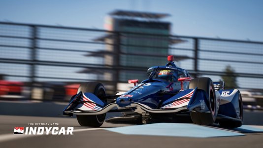
Whoever decided to remove the 3-letter-name leaderboard on the side of the screen needs to be taken into a dark room and slapped. It is an appalling idea. Why remove a graphic that helps people keep up to date with what's going on in the session. The on-screen graphics last year were fantastic. If this one doesn't have the rolling leaderboard on the bottom of the screen for the whole race, it will confirm how bad it is.
The backgrounds for the words need to be solid, not transparent, so we can see what it says regardless of the camera view.
Also, why is the new timer off-centre?


