You are using an out of date browser. It may not display this or other websites correctly.
You should upgrade or use an alternative browser.
You should upgrade or use an alternative browser.
Resource icon
TV Inspired OSD 9.4
Login or Register an account to download this content
- Author auroboros
- Creation date
- Added option to use your favourite OSD without displaying revs, lap & position numbers (compressed versions only).
- I finally went to the trouble of overlaying a hi res screen capture of a Sky F1 broadcast to match up the contour and perfecting sky sports version 2. Won't be spending anymore time on this.
Example:
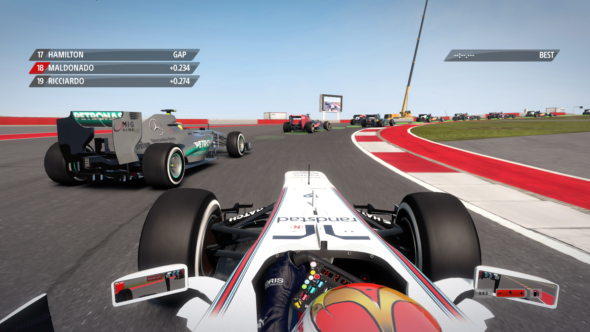
- Refined design of Sky Sports version 2. Curve matches TV, also the far left contour is darker over the position number graphic as on TV.
- Simple minimap now shows start/finish flag.
Examples:
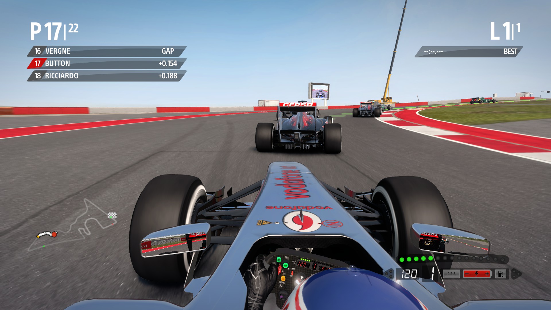
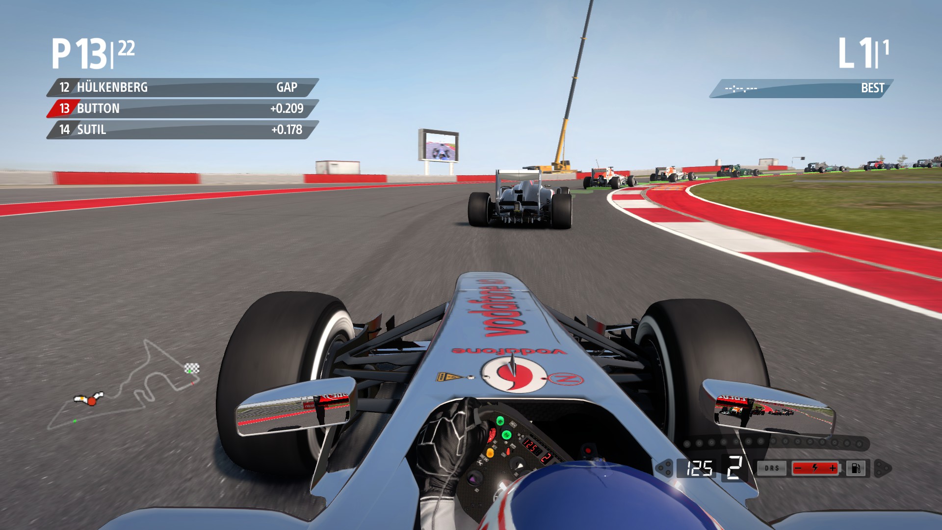
Until F1 2014, happy trails and enjoy!
I refined my first sky sports display to make it as close to real life as possible.
This is now version 2 in the zip file. That is it from me until 2014 comes out. Enjoy!
Examples:
black
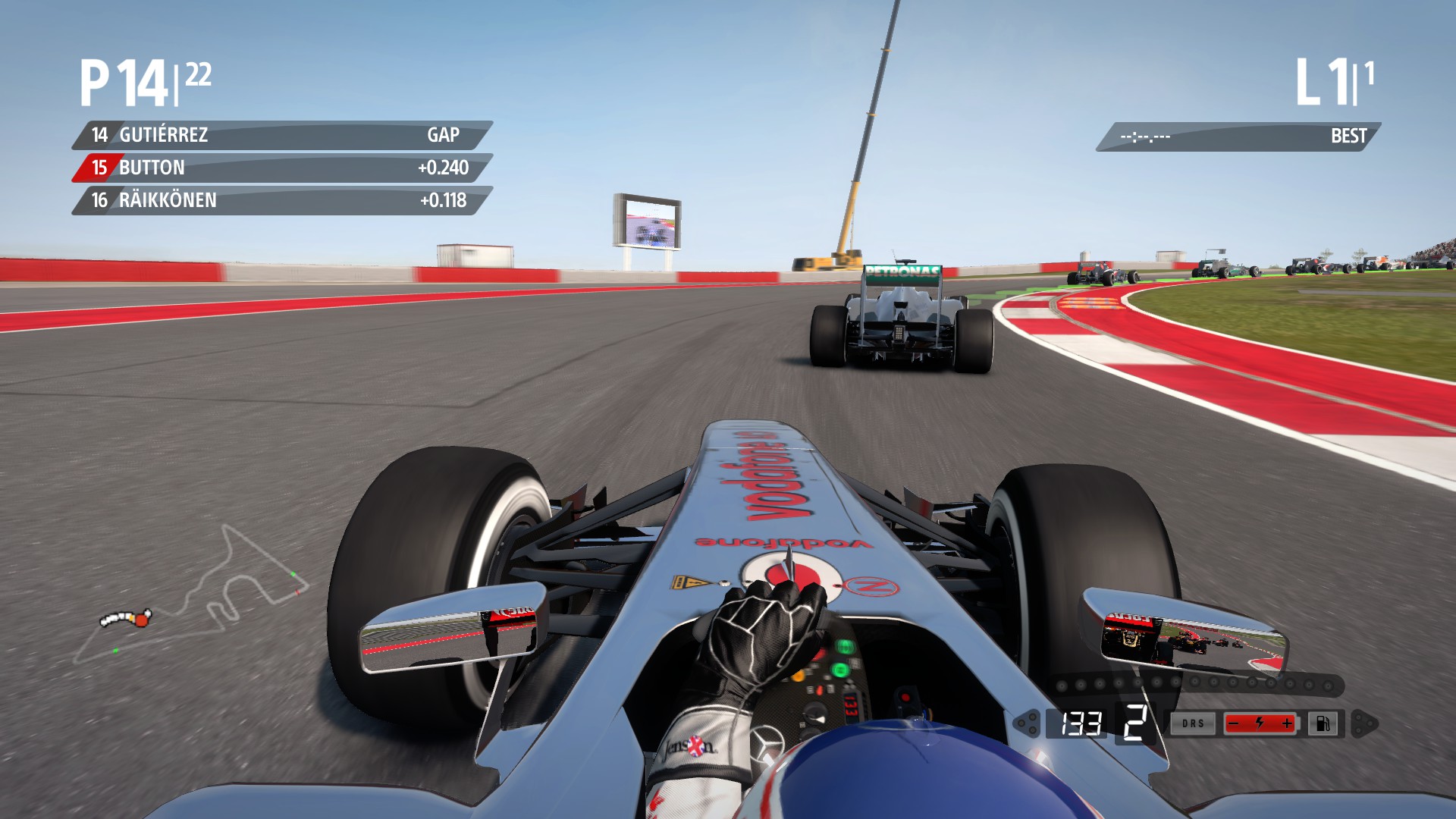
coloured
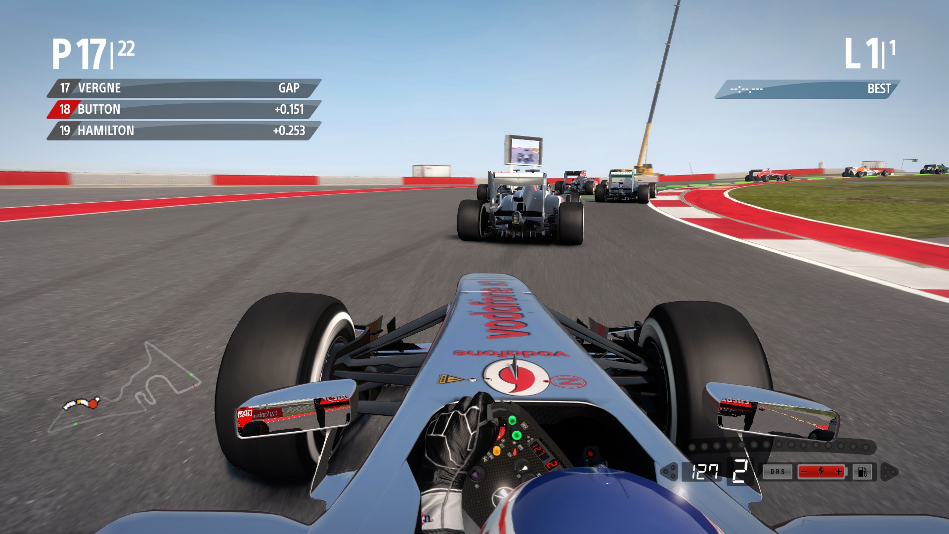
Perfected Sky Sports display. I also included a full colour version of the clear display.
Examples:
sky sports black
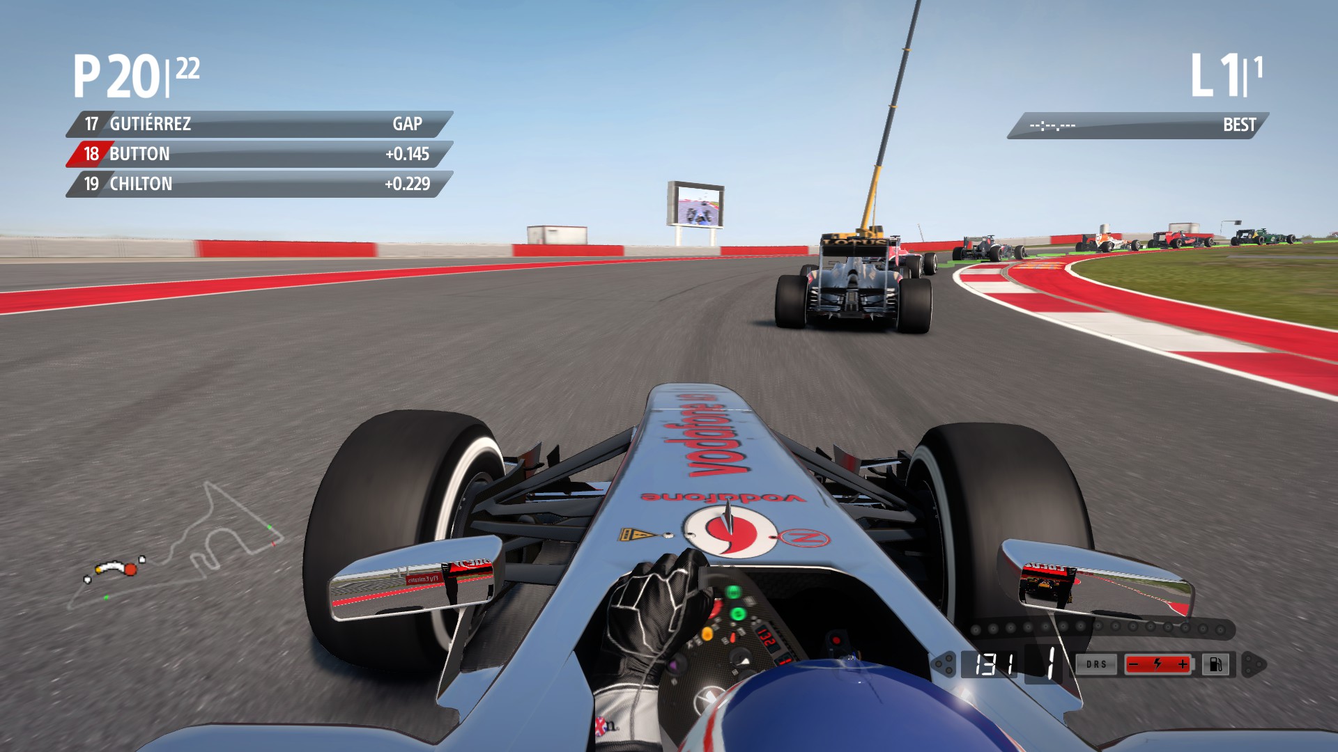
sky sports coloured
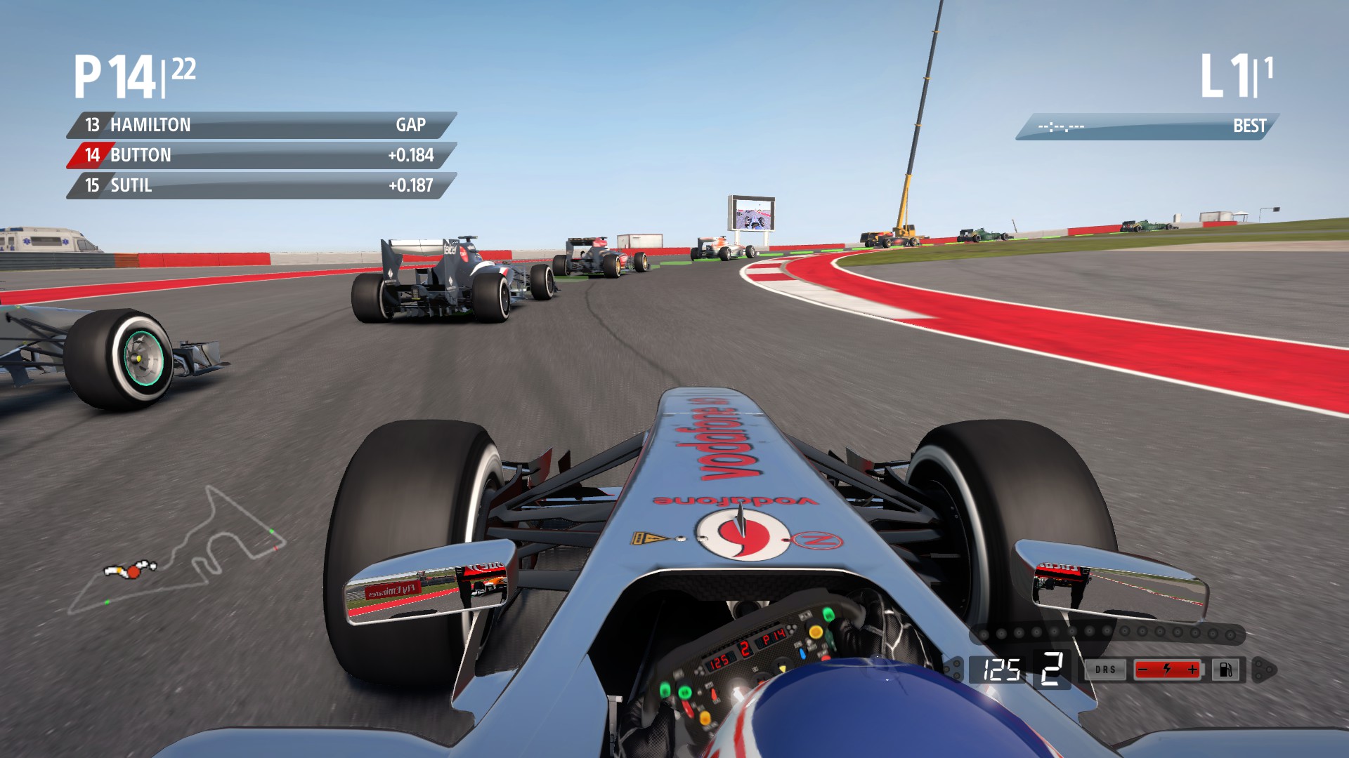
clear standard coloured full

clear swipe coloured full
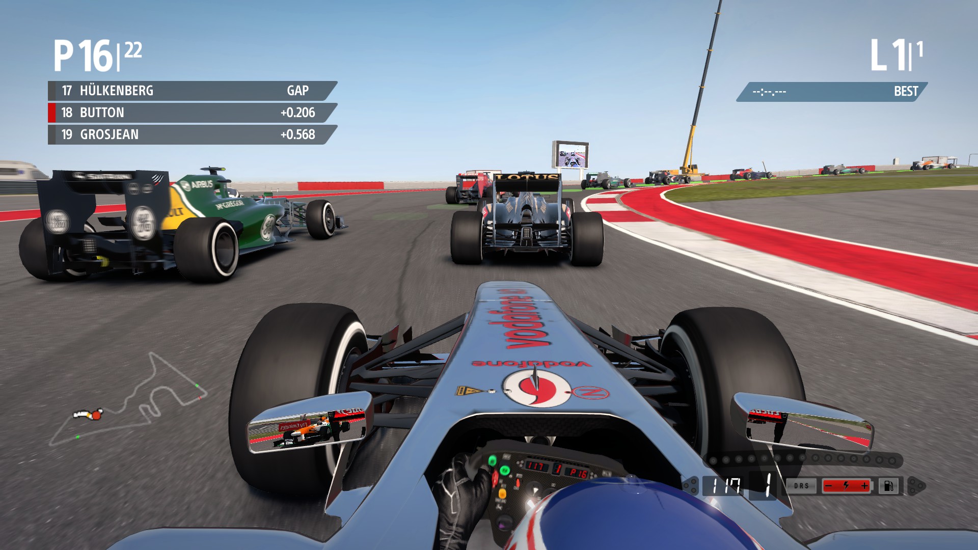
Enjoy!
New Sky Sports styled display as a bonus, final update.
Examples:
black
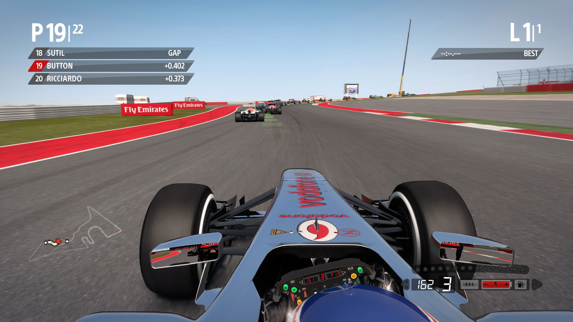
coloured
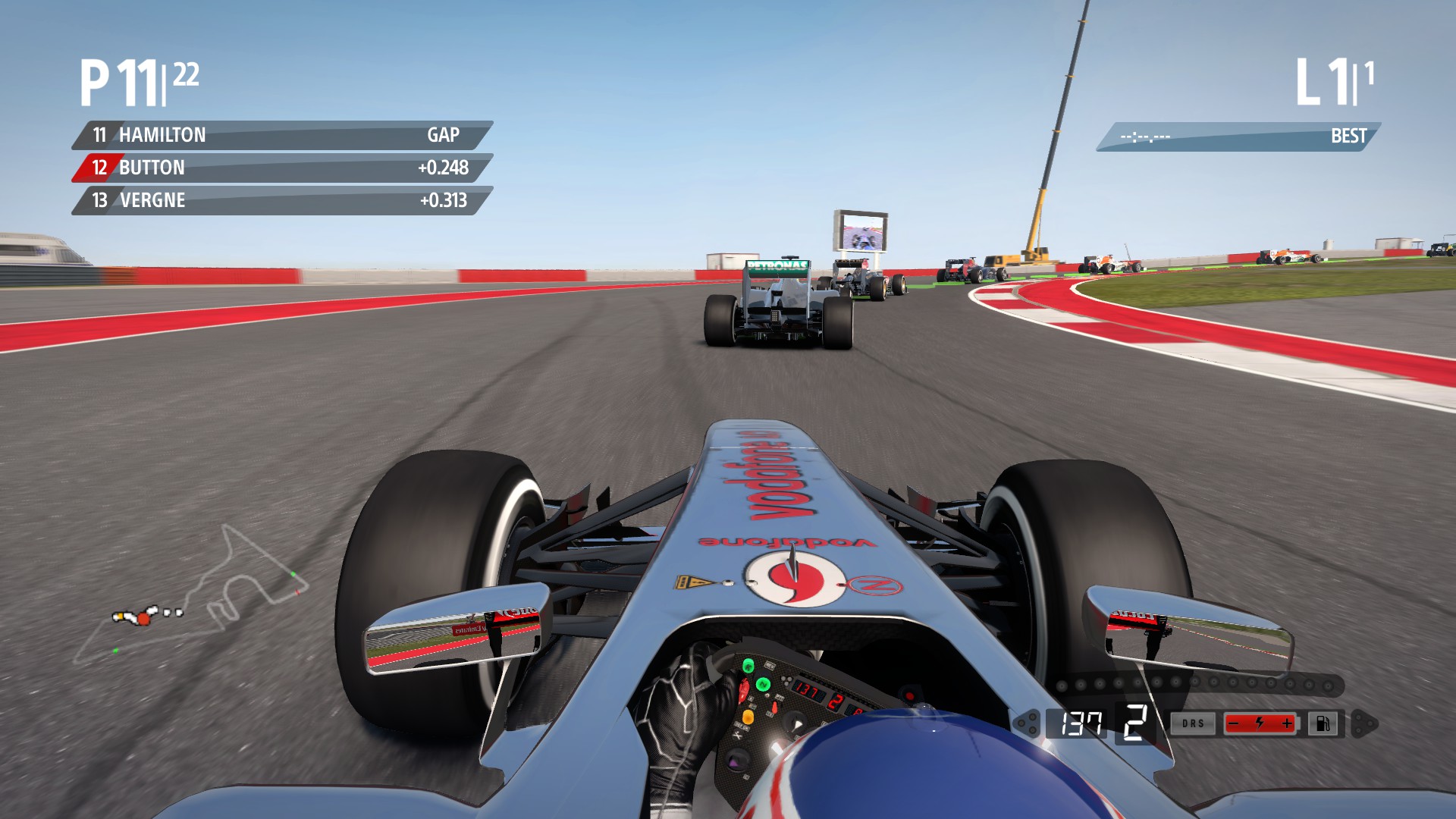
I did not make a swipe version because the swipe ruins the shade contour.
Enjoy!
Now that the display is HD, I removed the SD version and added the option to use a compressed DXT5 version of the HD display, for users with weaker specs.
Goodbye SD version. Enjoy!
Reworked all OSD display textures in double resolution. Final update until 2014 comes out, unless a request comes in. I supplied the SD version too.
HD Examples:
standard black
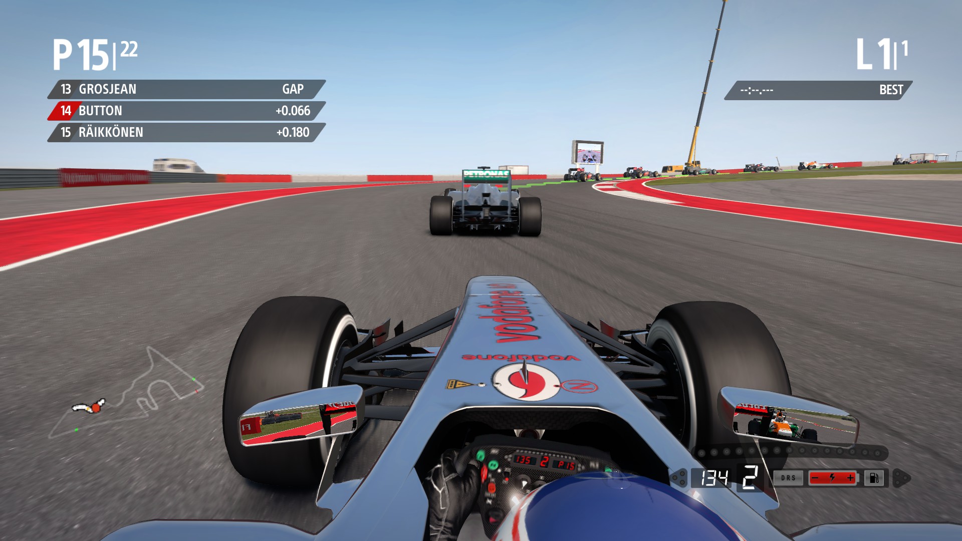
standard coloured
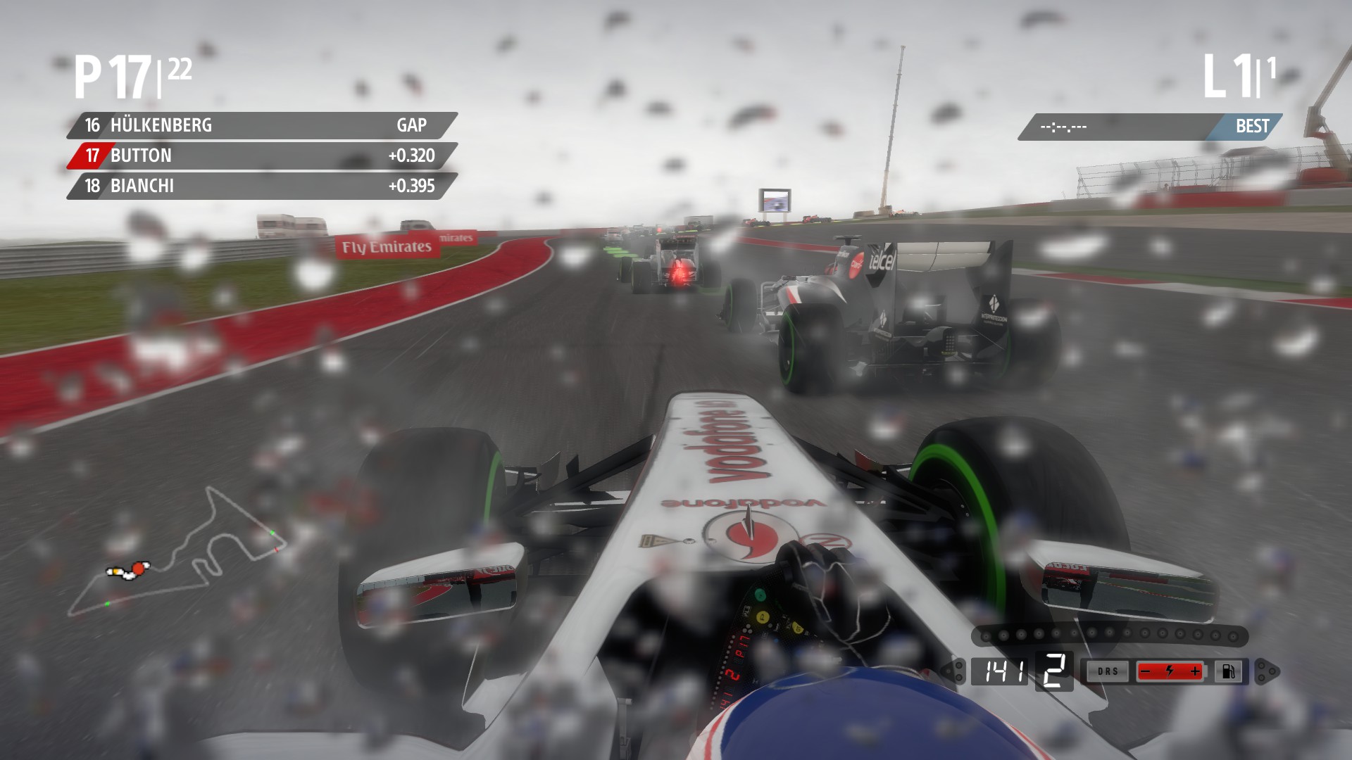
swipe black
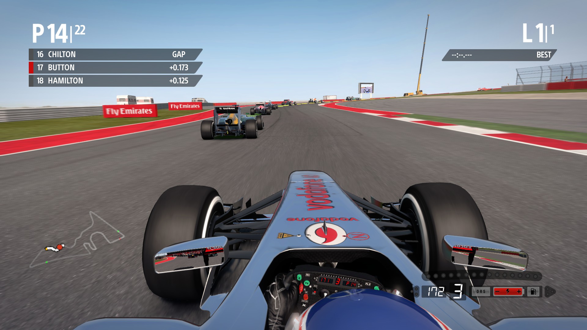
swipe coloured
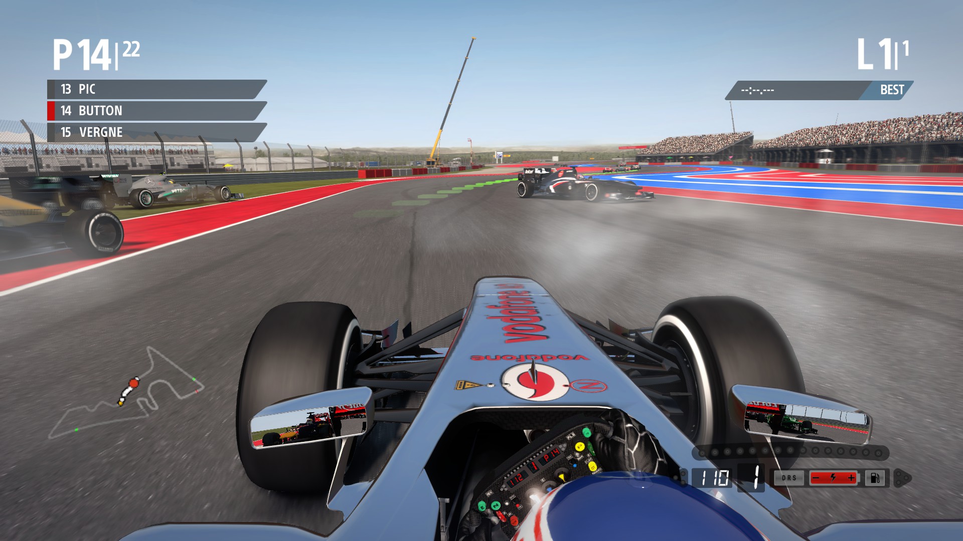
Please note: I highly recommend you use Winner's 'Slim' font (used in examples above) from his Game fonts play mod found here: http://www.racedepartment.com/forum/threads/game-fonts-play.87729/
This font is very similar to the one Sky Sports F1 uses. Thanks Winner!
Enjoy it!
This is an important amendment! I removed the unnecessary mask in the b_osd and d_osd (I made this for version 1) that made the lap display image glitchy. Perfect display now.
Enjoy, let me know in the discussion what OSD you are using! Also open to suggestions!
Reworked swipe display using the game's original coloured positions tab to achieve a gap-free swipe.
Examples:
swipe black
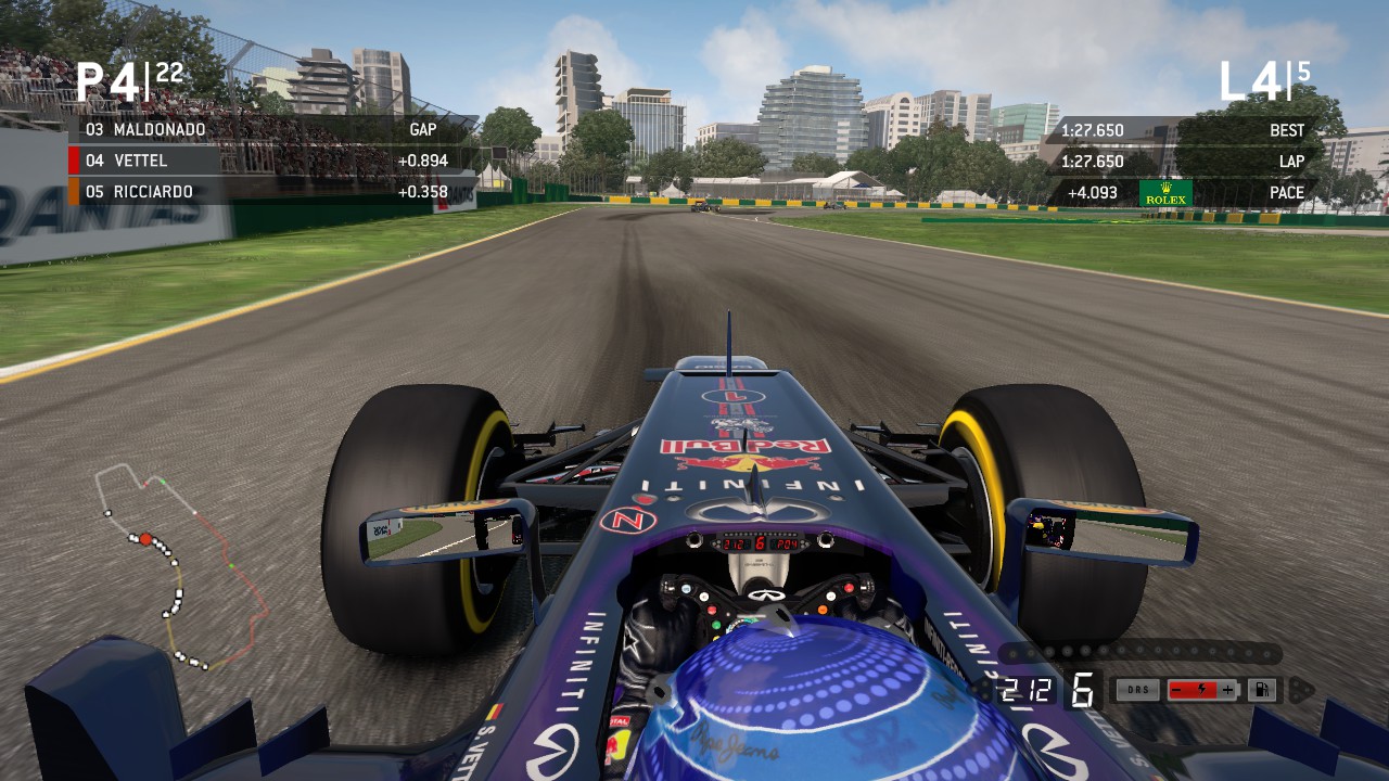
swipe coloured
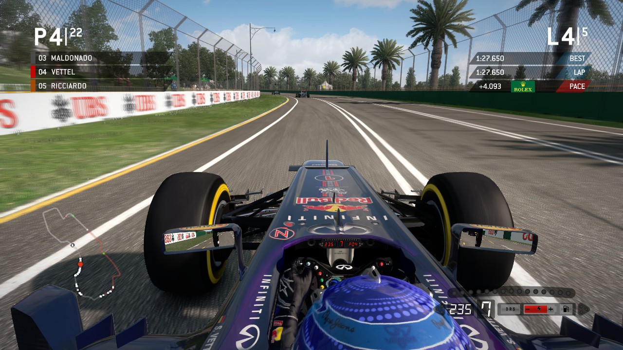
Please note that I removed all prior versions from the zip file, keeping only the standard displays from version 6. If you would like to use a prior version please send me a PM and I will help you out.
Enjoy!
I've made a big discovery which is now Version 6. I found a way to make the display dark black which now matches the end session display's darkness. It's also very similar to the Sky Sports layout's darkness.
I've included prior versions in the zip file if you do not wish to use.
Examples:
standard black
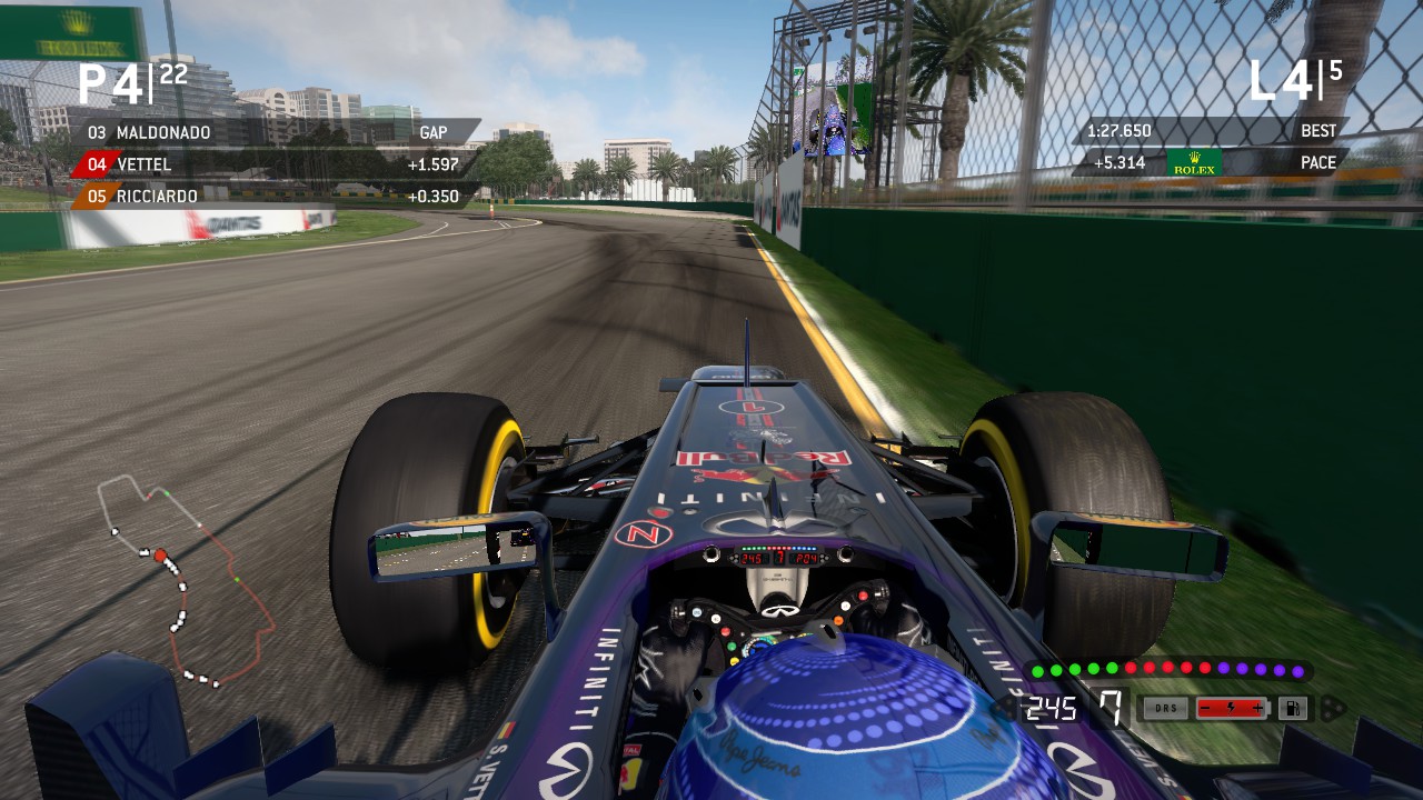
standard coloured
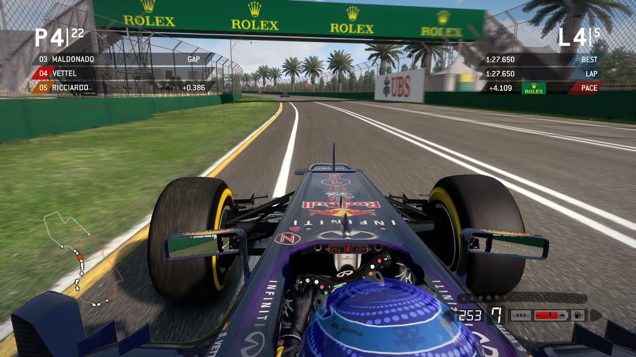
swipe black
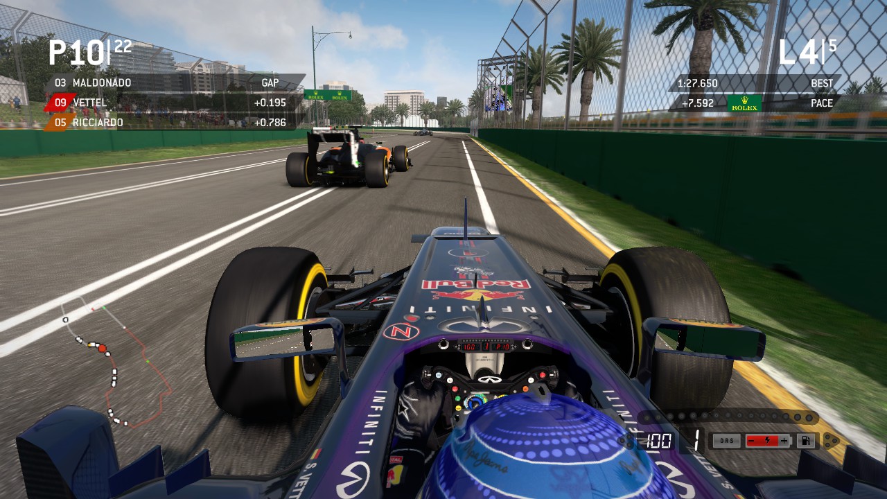
swipe coloured
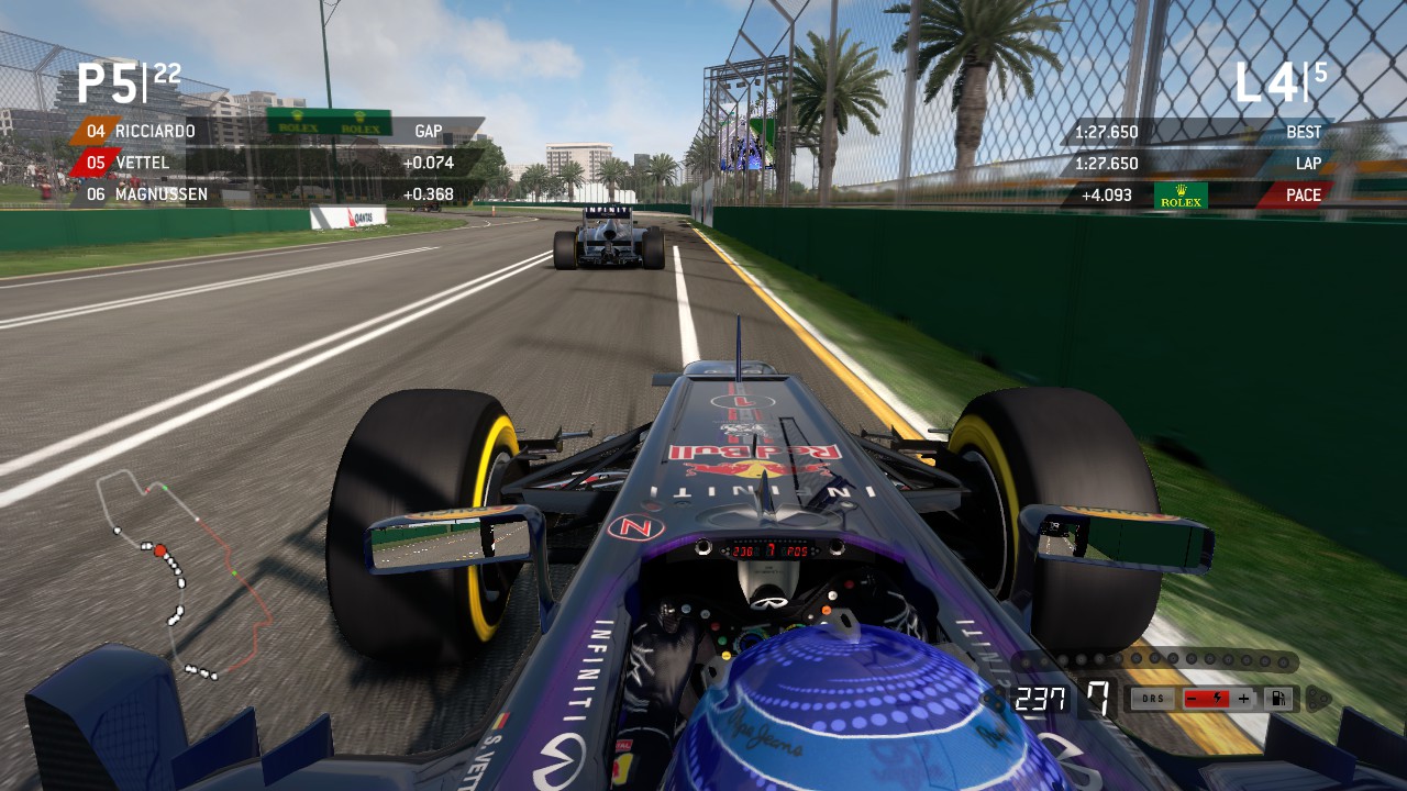
Please leave feedback or suggestions. Enjoy!
Now bringing you additional options to use a coloured and improved swipe display. Also added a slant on the black display.
Examples:
standard black
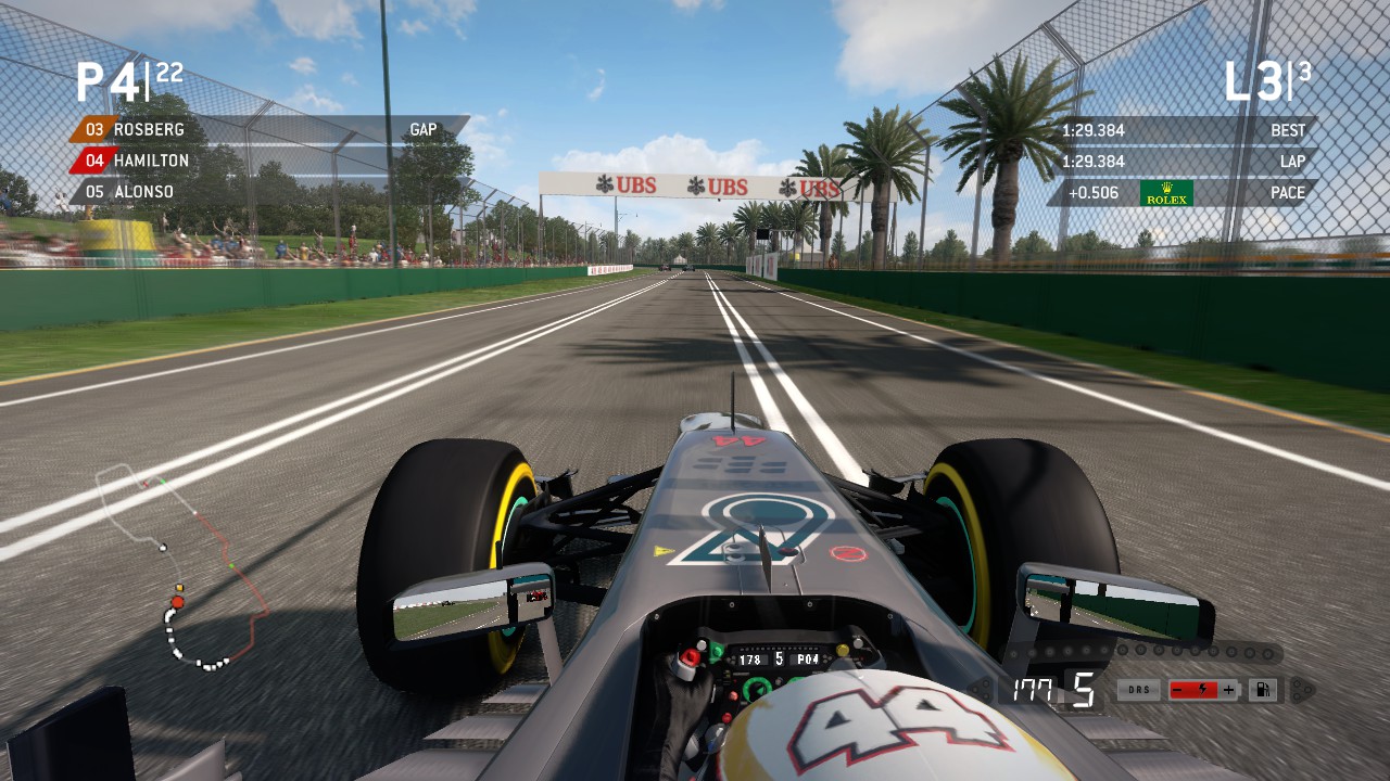
standard coloured
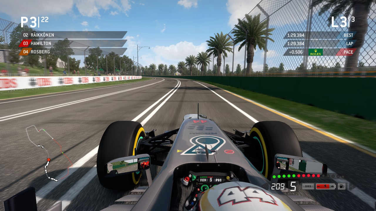
swipe black
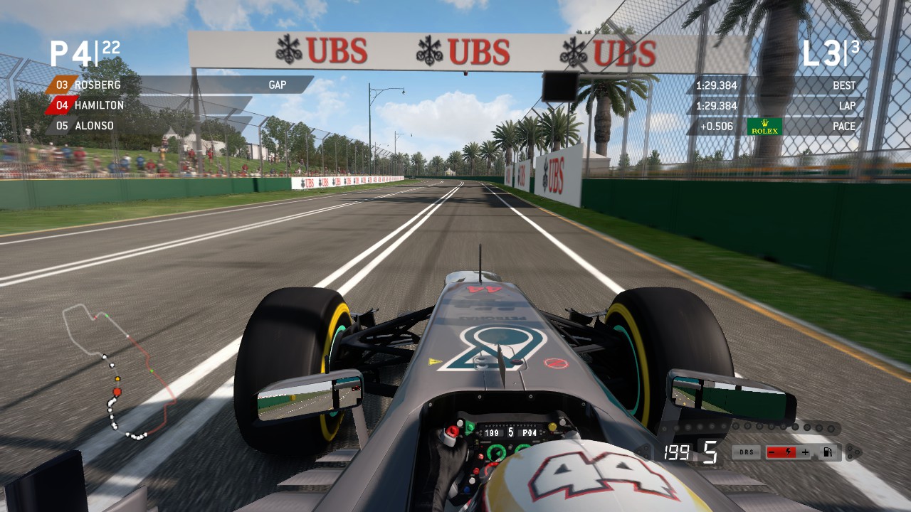
swipe coloured
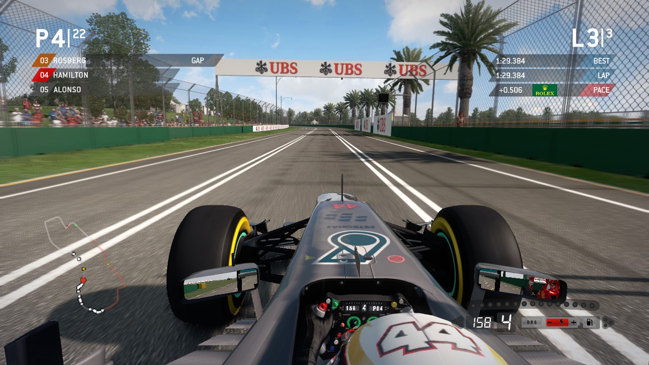
Version 4 is included in the zip file if you do not wish to use one of these. Enjoy!
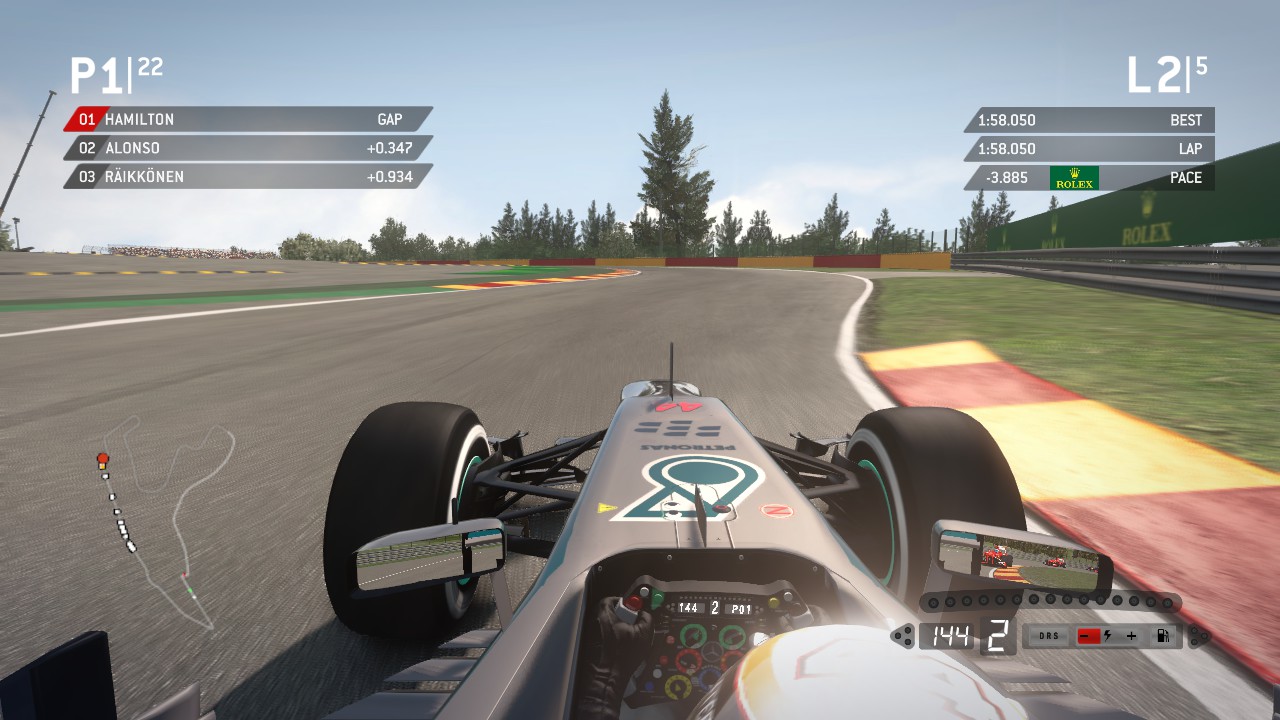
I have supplied a no flags version removing all flags except checkered flag.
I also reworked the slant edges using the game's flag design as a template (identical to Sky Sports F1), looks great now! I also edited the length of the display to make it small as possible.
Very happy with this version, my final update unless a request comes along. Thanks to all for your kind words of encouragement, enjoy!
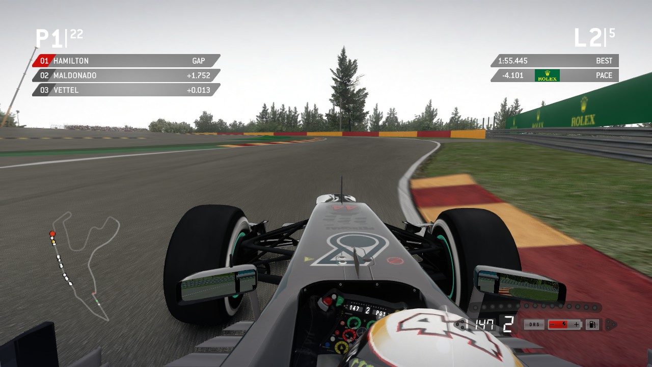
Refined slant edges and length of display to best match Sky Sports F1.
Also included is a simplified minimap removing the DRS and checkered flag symbols.
Enjoy!
A massive update here. The black backgrounds no longer slide when showing sector times! A HUGE THANKYOU to modder Salut Gilles for discovering the correct coding, I had almost given up! Please thank him if you enjoy this update!
I also made a few minor adjustments:
*Perfect alignment of colour pills to match black background.
*I adjusted the display sizes to match rendering of the times.
*Improved plus/minus on the KERS display.
ENJOY!
Latest News
-
Sim Racing Black Friday Deals 2024Black Friday is nearly here, but a lot of Sim Racing's top brands and names have already started...
- Connor Minniss
- Updated:
- 8 min read
-
Racing Club Schedule: November 17 - 24A new week means a new set of events in our Racing Club. Here's what's on tap from November 17...
- Yannik Haustein
- Updated:
- 3 min read
-
Macau Grand Prix in Sim Racing: Deserving of More?This weekend is the Macau Grand Prix and whilst a shadow of its former self, this tight street...
- Angus Martin
- Updated:
- 3 min read
-
How One Announcement Quadrupled Forza Horizon 4's Player BaseIt is exactly one month until Forza Horizon 4 will no longer be available to purchase online...
- Angus Martin
- Updated:
- 2 min read
-
Assetto Corsa EVO New Car Configurator In The PipelineAfter this year's sim Racing Expo, the excitement around Assetto Corsa EVO has continued to...
- Connor Minniss
- Updated:
- 2 min read
-
Steering Wheel Showdown: Which Wheel Would You Like A Sim Racing Version Of?Sim racers have plenty of choice when it comes to hardware. There are a number of cool steering...
- Yannik Haustein
- Updated:
- 2 min read
-
Gran Turismo 7: Yamauchi Teases New Cars For Update 1.53It is that time again when Gran Turismo series producer Kazunori Yamauchi teases us with an...
- Luca Munro
- Updated:
- 5 min read
