Tracks (WIP) Midfield Raceway (feedback welcome)

Hey there,

I am currently creating my first mod and would like to get some feedback on it. It is my favorite fictional childhood track from the Gran Turismo series, "Mid-Field Raceway". Recently I learned using Blender a bit and I decided to finally start this project. It's a lot of work and I would rather take my time and never finish it, than rushing it and get it wrong. So for now don't expect an almost finished track.
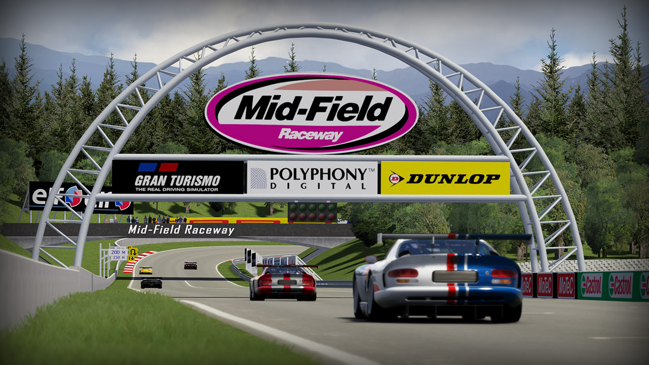
1611230518314.jpeg


First I started converting crdriver63's track from rFactor 1, but I decided to start from scratch, as this would make my life in blender easier (so I can now work with beziers and stuff, instead of a converted fbx).

Release 0.6 beta:


Changelog:
- better tree shadows
- higher tree texture resolution
- added fences around the track and some walls in the last two corners
- added f1 skin for cm by Ofitus21 (thanks!)
- converted all pngs to dds for better performance
- gave billboards a better material instead of plain colors
- some minor fixes
- grandstands like in GT6 and new spectators
- split the track up into multiple .kn5 files

I will probably stop working on it for the next few months due to personal reasons... But I still have big plans for the track and plan to continue building and improving it in the future.

I would be very happy if you gave it a test drive and give me any feedback.

Hint: The track is optimized for usage with CSP (custom shaders patch). If it doesn't look like this, you probably don't use CSP, especially regarding the 3D grass.

To-Do:
- rocks
- add some imperfections to walls and fences
- skidmarks
- more diverse textures for grass, rocks, etc.
- make textures look less repetitive
- tunnel reverb sound FX
- track lights for night races
- details, details, details

Thanks to:
- Sony/Polyphony for the great track
- NightEye87 and many others in the RD forum for the countless detailed answers to my noob questions
- LilSki and many others for the great tutorials
- steevee for the tv cameras
- Ofitus21 for the F1 skin and initial AI lines
- My buddy Tobsen for the feedback and fun we already had on the track
- All of you for the nice feedback I received on YT, RD, etc.!

Download track:

Car:
Nissan GT-R R35 GT500 2013
https://chivas-autoart.***********/home
 
Last edited:
Overall a good start I guess. I've never played GT so can't comment on its accuracy or flow :redface:

Everything feels a little too bright to me. Especially the crowds.
Also try to merge the crowds into one object with one material. You now have multiple objects with multiple materials, one of them being a lot brighter than the others.
Your tree is a Y-tree which is good. But it doesn't look like one because the faces are flipped, giving harsh lighting transitions.

Keep us posted :)
 
Thanks for the feedback! I use base values of .5 .5 0 0 (Ambient, Diffuse, Specular, SpecularEXP) for the shaders, as I saw it in some tutorial. Other were using .3 .3 0 0... maybe I'll try that in order to get everything a bit darker. Any opinions on the base values? Of course I will tweak them a bit from there, most of the time.

At the one crowd: I forgot to set the shader values for one material, thanks! It would be wise to merge them into one object with one material, I agree. This grandstand is one of the last remnants of the rFactor conversion I started with. I will do a makeover at some point anyway...

Regarding the tree I don't know if I got you (or the tutorial) right...

Well, I made it like this, because Assetto can only have textures on one side of a plane:
1608546591759.png


And if I enable Backface Culling in Blender (so I don't see the backface of a plane) and look at the normals, it seems to be fine (no flipped faces):
1608546741642.png


So maybe it's the space between the planes of the tree, which is wrong?!
 
Last edited:
Base values depend on the textures, mostly. Sometimes 0.15 is right, sometimes 0.5. Play around with it, try to match Kunos appearance.

For the tree, if you take a closer look:
20201221114657_1.jpg

Select the faces and flip them (Mesh > Normals > Flip). Also make sure to weld the vertices and set the normals to smooth (Right click on object > Shade Smooth (needs a normals reset sometimes depending on the mesh)).
 
When I weld (merge?) the vertices, I get one sided planes again... Then I tried duplicating and flipping the faces, which looks super weird:
1608549767912.png


Also, what mod are you using for a free cam? AFAIK, it doesn't work out of the box, right?
 
Or the ingame free camera, using either F5 (vehicle bound) or F7 (unbound). For that change:
Code:
[CAMERA]
ALLOW_FREE_CAMERA=1
inside assettcorsa/system/cfg/assetto_corsa.ini

When I weld (merge?) the vertices, I get one sided planes again... Then I tried duplicating and flipping the faces, which looks super weird:
View attachment 428809

Also, what mod are you using for a free cam? AFAIK, it doesn't work out of the box, right?
Don't weld the middle vertices to each other; just weld them "in place", so distance ~0.0001 m or so. They might already be welded, but just to make sure.
Or instead of welding them manually, enable the "Auto merge vertices" button
1608551131922.png

, select the verts, move them around and place them. It'll auto-weld then.
(It didn't save my mouse; sorry. It's that button next to the mirror XYZ buttons)
 
Last edited:
Thank you guys so much! You are really helpful :)

I guess it's getting better after merging all outer vertices, moving the inner vertices together, renaming the tree and also subdividing the faces like in LilSki's post. But it's still not perfect... What do you think?

Also, I thought about just copying some of Kunos' trees after converting one of their tracks to fbx and opening them in Blender. But I guess that wouldn't be considered legal or good practice if I want to release my track someday, right?

1608552818065.png

1608552842444.png
 
Yeah copying that from Kunos isn't considered legal. It would have helped if they released some SDK texture pack in the early days, to help with uniformity and ease. But yeah..

Something is still not quite right. I can take a look if you want?
 
Also, I just changed the shader from ksPerPixelAT to ksTree... It makes a small difference:
1608553354984.png
1608553368315.png


Is that better?

You are more than welcome to take a look, of course. What do you need? The tree as fbx? Whole track? Or would you like to talk over discord? (in that case just write me a private message)
 
Yeah copying that from Kunos isn't considered legal. It would have helped if they released some SDK texture pack in the early days, to help with uniformity and ease. But yeah..

Something is still not quite right. I can take a look if you want?
didn't they mention that using their tree was ok ?
same as using their sound library for car ?

@Psy185 seems like a normal issue
but the kstree_group_a_1 (example) naming should apply normals automatically for you (if the pivot center is at the lower center)
 
Well I played around and now it looks like this... What do you think?
1608554923622.png
1608554941957.png


In my opinion, the difference between a sunny and a shadowed side is strange... I tried fixing that by playing around with the Ambient and Diffuse values and came up with 1 and 0.3 respectively, but it still looks weird.

And I renamed it correctly and also set the origin to the bottom center of the tree.
 
Thanks to NightEye, my Trees look great now.

Another question: how can I set the angle of the sun? How is North defined? By the x/y axes in Blender? By the settings in the Illumination tab in ksEditor? Something else? :D
 
Last edited:
Thanks to NightEye, my Trees look great now.

Another question: how can I set the angle of the sun? How is North defined? By the x/y axes in Blender? By the settings in the Illumination tab in ksEditor? Something else? :D
in top view, the north is up ? i think :p
then in the ini file or in Content Manager, you can set up the localization of your track

Example:
1608681492290.png
 
Last edited:
Thanks Ben!

That would mean the sunlight is coming from north in my case, though :D

Also: is it normal the sun is always coming from the same cardinal point, no matter what time of day I am using? I am not using Sol btw, because I wanted to mod the track so it looks nice in vanilla first.
 
Yes, AC's sun system is rubbish. The lighting.ini provides the North point (heading=0 means "up" in top view is north), the angle provides the maximum inclination (use negative or >90 for southern hemisphere locations (not sure if zenith is 0 or horizon is 0; easy to check)). It always rises in perfect East and sets in perfect West..
For CM users, simply plug in the coordinates (or choose from the map) and you'll get correct Sun, Moon and star positions.
 
Thanks! Done that... but I got the next problem with trees :(

I created a bunch of trees and named them accordingly. But they look pretty crappy :D They reflect light kinda like a single object instead each of its own.

Editor
1608731166809.png


In Game
1608731254172.png


Naming
1608731283677.png

I know it's probably a fir and not a pine :D

Ideas anyone?
 
Your naming convention is correct, but you should be using the kstree shader, with much lower ambient and diffuse values (about 0.15 - 0.2 for each and adjust the texture for the correct exposure)
 

Latest News

Shifting method

  • I use whatever the car has in real life*

  • I always use paddleshift

  • I always use sequential

  • I always use H-shifter

  • Something else, please explain


Results are only viewable after voting.
Back
Top