Narrow and Wide styles

Bram Hengeveld

Website Founder
OverTake
Premium
The final update before we'll install Xenforo 1.4 in the next two weeks is done.

The left and right sidebar styles have had their purpose during last weeks testing (thanks for that) and have now been replaced by a default style called RaceDepartment (Fixed) and an optional style called RaceDepartment (Fluid) for those of you that don't like a narrow layout and love huge white space instead.

By default the fixed style is served but you can opt for the wider one by clicking the selector at the left bottom of each page and switch between the style.
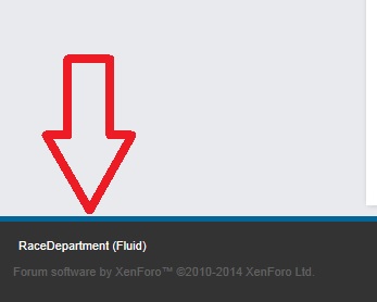
fluid.jpg


First one that complains that the fluid version is too wide gets a kick in the face (no joke) :laugh:
 
(I'm going to get told off for this)

Nothing wrong with the width, but why is it permanently sidebar left now? You didn't want a popularity contest, but out of everyone that commented, no one complimented sidebar left, they all wanted sidebar right back. Now we can't change it back.
 
They had the change to use it for a week and whopping total of 18 members in total used the right sidebar layout. If they represents 18 people, than they are the minority.

Secondly we are having plans for XF 1.4 to use the right space for something cool so instead of keep on going and going I suggest moving on.
 
(I'm also going to get told off for this..:unsure: )

The left sidebar is what you chose as the default for the site. If the right sidebar was chosen as default, I think there would be more people using the right sidebar. I only figured out that I can change the sidebar after 2 days! So not everyone came right onto this thread, and saw how to change the sidebar.
Well, I hope it's really something cool on the right side (a.k.a. sidebar :D)

That's my last word here.
 
Let me explain why right sidebar is better.

The english language is read from left to right. When you open a page, your eyes are drawn left and move right. As the main bit we all want to see when we come to the website is the threads, that should be the first thing seen when the page loads. Twitter has been wrong for a long time, and I don't want my favourite Forum to get stuck down that route.
 
@Jimlaad43 that's one of the reasons we've gone with a left sidebar. This is where features such as trending topics and other cool stuff like that is shown off. When you come to a thread, you came to it to read the content - so we don't really need to draw your eye to the thread content as that's what you came for! :) The sidebar has other topics and things that could be of interest, so we'd like to advertise those to you, rather than have them be ignored on the right hand side of the page.

It's there to help show you other topics, media and mods that could be of interest to you. With sidebar right, this information is lost as there is no draw to read it.

We're not doing it to spite you guys, and I somewhat prefer the aesthetic of sidebar right, but for functionality sidebar left is far better. We're getting used to it, and sidebar left is commonplace in many major websites such as Facebook, Twitter, Wikipedia and YouTube. It's not a massive change that will adversely impact your reading experience, as it's really a very minor change.

Other than that, as Bram said, we'll need the space for some cool things!
If we get something on the right with a similar width it is fine, but I have a two screen layout and my neck is starting to hurt reading topics here as the content is on right edge of my monitor with the fixed layout. With fluid it is a bit better, but then every line is really long, which is really annoying.

I can understand, that you want to draw attention to the sidebar, but I hope we get something on the right so the really interesting content (the thread I is at least in the middle.

In a thread like this with fixed I have 40% of my screen wasted with blank space and have to read on the "uncomfortable" right side for us europeans.

Here a screen from my view with fixed layout. It is a real pain. I hope we get something on the right soon.

screen12huai.png
 
They had the change to use it for a week and whopping total of 18 members in total used the right sidebar layout. If they represents 18 people, than they are the minority.

Secondly we are having plans for XF 1.4 to use the right space for something cool so instead of keep on going and going I suggest moving on.

I don't think there actually were more than 18 people that even had a clue they could change back from left to right....

I knew about it but decided to try and use left layout to see if i could get used to it but it feels wrong and - as has been said here above - it's a uncomfortable way to read a forum imho. I understand your arguments for doing it but we (the users) don't necessary have to agree. :)

Oh and the fluid layout...well, i do like that. :cool:
 
Are the circular avatars going to stay? There are quite a lot of avatars that don't work as circles (eg mine), and even some default avatars look wrong in it when the name is clicked on.
 
I clicked on the Race Department (Sandbox) thing and clicked Race Department 9.0, and it changed, but the thing to click has disappeared, so I can't change it back.
 

Latest News

Do you prefer licensed hardware?

  • Yes for me it is vital

  • Yes, but only if it's a manufacturer I like

  • Yes, but only if the price is right

  • No, a generic wheel is fine

  • No, I would be ok with a replica


Results are only viewable after voting.
Back
Top