Doug62
Premium
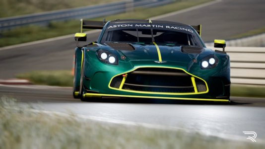
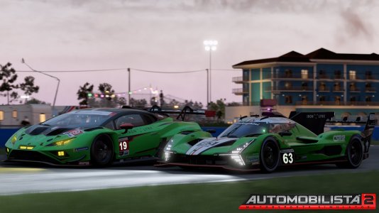
Not normally a believer in using a previous designs twice but this cars template resembles a train wreck. Too broken up, Too many parts that could have or should have not been removed from it's joining part. It has far to many parts that could have/should have been put on another template because you really wouldn't change it being under the car or parts obscure enough that you wouldn't think to change it's color. Because of this the main body parts that you'd want to paint are smaller than they should be to make room for all the obscure effectively making the livery a lower resolution finish. Example a 4K template = a 2K finish.
All this adds up to a template that creates a lot of work to line up paint lines between all the brake down, reduces your options to were you do logo placement without having a brake through the logo from one part to another and then at the end you get a lower resolution finish. I kind off understand why this car is being past over by many painters.
Personally, I'm not that interested in this car to continue doing any more liveries for it considering the work, the end result and ultimately the lack of interest, downloads for it as a rFactor2 car.
AC liveries get at worst 3 times the amount of downloads than a rFactor2 car. This car hasn't equaled rF2 cars so far.


