You are using an out of date browser. It may not display this or other websites correctly.
You should upgrade or use an alternative browser.
You should upgrade or use an alternative browser.
Can you make links a differnet COLOR please?
- Thread starter AMA_King
- Start date
Latest News
-
Need For Speed Unbound To Add Playable Motorbikes In Vol. 9Throughout the rich thirty-year history of Need For Speed, motorbikes have always evaded the...
- Connor Minniss
- Updated:
- 3 min read
-
Revisiting Our Top 3 2024 FIA WEC Moments in Le Mans UltimateThe 2024 FIA World Endurance Championship may be over but its intense action rests heavy on the...
- Angus Martin
- Updated:
- 6 min read
-
Community Question: Which Car Would You Like To See Brought To Assetto Corsa?Assetto Corsa is renowned for being the most versatile racing simulator on the market with...
- Connor Minniss
- Updated:
- 2 min read
-
"A Lifelong Dream": How OverTake Community Members Tackled The Mantorp 6 HoursSim racing can have a great sense of community. A handful of OverTake members took this one step...
- Yannik Haustein
- Updated:
- 6 min read
-
F1 Manager 2024: Pit Lane Starts & More New Features In Latest UpdateAs the Formula One season starts to draw to a close, F1 Manager 2024 has been hit with a big...
- Connor Minniss
- Updated:
- 2 min read
-
Weekly Races & Twitch Broadcasts: Join The OverTake British GT4 League In ACC!Motorsport's real-world racing series are all winding down as 2024 enters the final stretch -...
- Yannik Haustein
- Updated:
- 2 min read
-
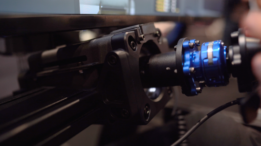
WATCH: Sensit! Aims To Simulate That Seat-Of-The-Pants FeelingOne thing sim racing cannot really replicate well is the sensory feedback drivers get from their...
- Yannik Haustein
- Updated:
- 1 min read


