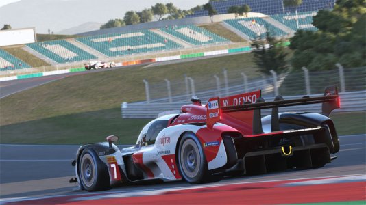
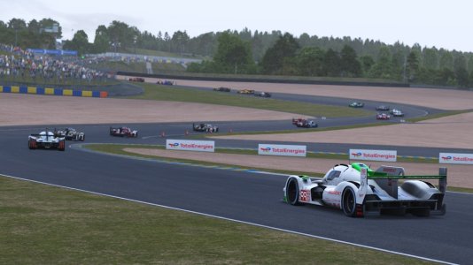
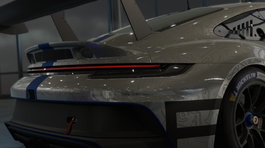
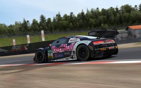
2023_LeMans_Penske_Motorsport_#75

Skins 2023_LeMans_Penske_Motorsport_#75 1.2

Login or Register an account to download this content
looks good but needs a little tweaking :)
please check the red stripe on the rear. The original car has a straight stripe


__custom_showroom_1689460562.png


1.jpg
 
Last edited:
Wonderful skin. Had to tweak the ext_config so the IMSA panel would be hidden (on the newly released ACF car). Definitely the best quality skin for this livery. Hopefully you will make the 5 & 6, and maybe others too? Thank you!
 
Wonderful skin. Had to tweak the ext_config so the IMSA panel would be hidden (on the newly released ACF car). Definitely the best quality skin for this livery. Hopefully you will make the 5 & 6, and maybe others too? Thank you!
Thank you very much for the motivating words.
I'm working on the #5 and #6, i will upload them later.
Cheers!
 
Some feedback:
  1. the Racing for Charity should only appear on the drivers right hand side wheel arch, not on both sides.
  2. There are 2 porsche logos on the hood
  3. the font for the number plates and should be 'Porsche Next TT' (you can find it for free with some Googling), just like the one on the Racing for Charity decal.
  4. The Michelin man logo in the side intake looks off, should be using the all white version
  5. The Boss logo on the rear wing should be using this version
  6. The Porsche logo on the rear wing should be moved up a little bit so that it doesn't touch the fin (see Salty Drayl's version for a good representation of it)
  7. Its a bit hard to explain, but the driver's names flag should be mirrored on the opposite side (car's nose facing the right of your screen). This race version might help to visualize
  8. Are you trying to follow the presentation livery or the actual race version? There's actually a bit of a difference in the two:
    • the Driver's names are split between the light and dark blue roof bands for the presentation version, but are combined in the light blue section for the race version.
Looks good and crisp so far. keep up the good work :)
 
Last edited:
Some feedback:
  1. the Racing for Charity should only appear on the drivers right hand side wheel arch, not on both sides.
  2. There are 2 porsche logos on the hood
  3. the font for the number plates and should be 'Porsche Next TT' (you can find it for free with some Googling), just like the one on the Racing for Charity decal.
  4. The Michelin man logo in the side intake looks off, should be using the all white version
  5. The Boss logo on the rear wing should be using this version
  6. The Porsche logo on the rear wing should be moved up a little bit so that it doesn't touch the fin (see Salty Drayl's version for a good representation of it)
  7. Its a bit hard to explain, but the driver's names flag should be mirrored on the opposite side (car's nose facing the right of your screen). This race version might help to visualize
  8. Are you trying to follow the presentation livery or the actual race version? There's actually a bit of a difference in the two:
    • the Driver's names are split between the light and dark blue roof bands for the presentation version, but are combined in the light blue section for the race version.
Looks good and crisp so far. keep up the good work :)
when i saw the huga amount of text, it shocked me :confused:
, but this its super helpfull. Incredible good eye for detail!
I used both the presentation version and the race version as a reference, wich cause the inconsistencies.

I will try to take update soon working whit your feedback!

Cheers!
 
when i saw the huga amount of text, it shocked me :confused:
, but this its super helpfull. Incredible good eye for detail!
I used both the presentation version and the race version as a reference, wich cause the inconsistencies.

I will try to take update soon working whit your feedback!

Cheers!
No problem, happy to help. Your version seems very promising and i think with some improvements it will be the best version of this livery. I sent you a PM too by the way :)
 
Some feedback:
  1. the Racing for Charity should only appear on the drivers right hand side wheel arch, not on both sides.
  2. There are 2 porsche logos on the hood
  3. the font for the number plates and should be 'Porsche Next TT' (you can find it for free with some Googling), just like the one on the Racing for Charity decal.
  4. The Michelin man logo in the side intake looks off, should be using the all white version
  5. The Boss logo on the rear wing should be using this version
  6. The Porsche logo on the rear wing should be moved up a little bit so that it doesn't touch the fin (see Salty Drayl's version for a good representation of it)
  7. Its a bit hard to explain, but the driver's names flag should be mirrored on the opposite side (car's nose facing the right of your screen). This race version might help to visualize
  8. Are you trying to follow the presentation livery or the actual race version? There's actually a bit of a difference in the two:
    • the Driver's names are split between the light and dark blue roof bands for the presentation version, but are combined in the light blue section for the race version.
Looks good and crisp so far. keep up the good work :)
And i almost trew my computer out of the window because when i finished the flags at the driver names, i saw it should be the other way around, but apparently both where correct, just one one the left side, and the other on the right, flags facing the nose of the car..
 
And i almost trew my computer out of the window because when i finished the flags at the driver names, i saw it should be the other way around, but apparently both where correct, just one one the left side, and the other on the right, flags facing the nose of the car..
lol. oh yea i forgot to mention, if you're following the race version, the windscreen banner of the #75 should also be red like the fin color ;)
 
Some feedback:
  1. the Racing for Charity should only appear on the drivers right hand side wheel arch, not on both sides.
  2. There are 2 porsche logos on the hood
  3. the font for the number plates and should be 'Porsche Next TT' (you can find it for free with some Googling), just like the one on the Racing for Charity decal.
  4. The Michelin man logo in the side intake looks off, should be using the all white version
  5. The Boss logo on the rear wing should be using this version
  6. The Porsche logo on the rear wing should be moved up a little bit so that it doesn't touch the fin (see Salty Drayl's version for a good representation of it)
  7. Its a bit hard to explain, but the driver's names flag should be mirrored on the opposite side (car's nose facing the right of your screen). This race version might help to visualize
  8. Are you trying to follow the presentation livery or the actual race version? There's actually a bit of a difference in the two:
    • the Driver's names are split between the light and dark blue roof bands for the presentation version, but are combined in the light blue section for the race version.
Looks good and crisp so far. keep up the good work :)
Are you sure about the font for the numberplates? im pretty sure the WEC and Le Mans numberplates are always Helvetica Neue.
And the Porsche next i allready use, just not the TT version, i will download it.
e you sure about the
 
Are you sure about the font for the numberplates? im pretty sure the WEC and Le Mans numberplates are always Helvetica Neue.
And the Porsche next i allready use, just not the TT version, i will download it.
Yep, take a close look at the number 5 and compare between Helvetica Neue and Porsche Next fonts
 
Jim1986 updated 2023_LeMans_Penske_Motorsport_#75 with a new update entry:

Lots of changes

changelog
- Changed font on doornumbers and Racing For Charity to the correct one.
- removed Racing For Charity on the left side
- driver nation flags all facing towards the nose of the car now
- window banner is now red as it should be
- michelin logo on side improved
- Boss logo improved
- added WEC logo on the sides
- straigtened the coloured lines on the back of he car
- Porsche logo on rear wing moved up

Thanks GeForce06 and TheCameraGuy for the kind feedback!

Read the rest of this update entry...
 

Latest News

Shifting method

  • I use whatever the car has in real life*

  • I always use paddleshift

  • I always use sequential

  • I always use H-shifter

  • Something else, please explain


Results are only viewable after voting.
Back
Top