You are using an out of date browser. It may not display this or other websites correctly.
You should upgrade or use an alternative browser.
You should upgrade or use an alternative browser.
Resource icon
SOB_Dash skins for PDash 3.2
Login or Register an account to download this content
- Author Russell Sobie
- Creation date
Added 8th gear to SOB_Dash4 and 5. Now it won't show a blank when racing in the Ferrari SF70H!
Somehow I had an older background.png in SOB_Dash5, so it didn't line up with the revzone graphics. All fixed now.
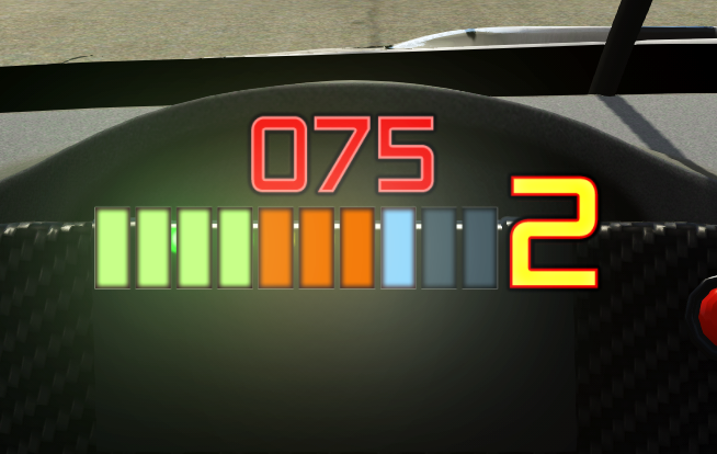
If you are a bit OCD like myself, you may have noticed that SOB_Dash5 has this issue where a change in speed or gear change will draw that number ontop of the nice new auras I've added to the revzone lights... but then when the rev changes, the light aura will draw over the speed/gear indicator. This was driving me a but nuts, so I added some "shadows" in the auras that basically make this no longer happen. Not really sure how a bunch of pixels representing your speed or current gear can cast shadows on basically nothing, but hey, it works!
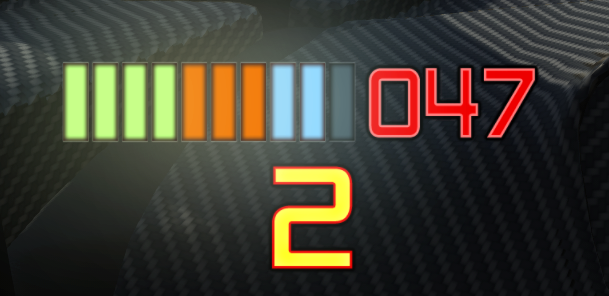
Realized I wasn't seeing the speed value as easily as I like, so I re-arranged the elements from Dash 4 into one that works a bit better for me. The choice is yours!

After a number of weeks using SOB_Dash3, I realized a couple of things:
So to address both of these things, I bring you SOB_Dash4. Looks like this in game (note the aura, which makes it really obvious what the progress on the bar is well outside your normal vision window).
- I was looking down at all those dots only on one side, right before I was supposed to shift, rather than using peripheral vision.
- There's a really easy way to make lights look like they are actually glowing that I never thought to incorporate into one of my dashes.

Enjoy!
Upgraded my rig to use a 42" television at 1080p instead of my fancy gaming monitor that is a 27" 1440p, so I thought I'd make a new dash that really only bothers with the things I care about: speed, gear, and shift indicator.

Latest News
-
2024 Brazilian Grand Prix Community RecapAfter one of the most chaotic, action-packed and awe-inspiring race weekends of the Formula One...
- Connor Minniss
- Updated:
- 5 min read
-
Test Drive Unlimited: Solar Crown Players To Recieve In-game CompensationIn the latest patch announcement for Test Drive Unlimited: Solar Crown (TDUSC), compensation for...
- Connor Minniss
- Updated:
- 2 min read
-
RaceRoom DTM 2024 Pack Is Ready, But More Patience Is NeededThe DTM season has concluded, and fans are still waiting for the RaceRoom DTM 2024 Pack. The...
- Yannik Haustein
- Updated:
- 2 min read
-
EXOcars Preview: High Octane VR Buggy RacingFrom the streets and stadiums to deserts, mountains and tropical paradises; this is EXOcars, a...
- Connor Minniss
- Updated:
- 3 min read
-
Follow Jimmy Broadbent's Sixth Race For Mental HealthAt the end of every year, sim racing streamer Jimmy Broadbent hosts a fun 23 hour race around...
- Luca Munro
- Updated:
- 5 min read
-
2024 Formula One Brazilian Grand PrixAfter arguably the most controversial race weekend of the season so far, Formula One turns to...
- Connor Minniss
- Updated:
- 4 min read
-
Racing Club Schedule: November 3 - 10A new week means a new set of events in our Racing Club. Here's what's on tap from November 3 to...
- Yannik Haustein
- Updated:
- 3 min read
