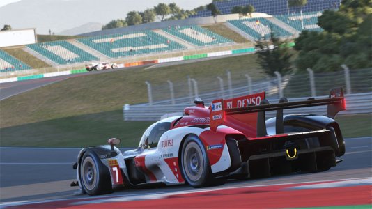
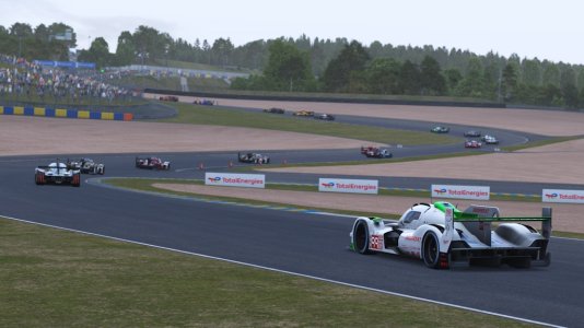
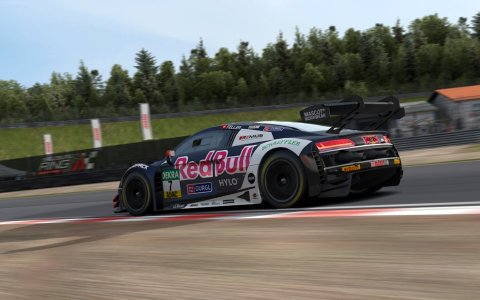
This post process filter is made for the best possible visuals by using the most neutral values for color, color temperature, saturation, brightness and contrast. I tested many filters and especially the contrast was always to intensive. Other problems were the saturation (too much or too less) or brightness.
This filter was made to get a optimal color gamut with the knowledge of a professional printer. You will especially see the difference to other filters if you are using a calibrated monitor. The Pure version was developed with friendly help by the Pure author Peter Boese.
This is the filter I'm using for all my track previews.
Features:
-neutral value for color (0.0)
-neutral value for contrast (1.0)
-neutral value for saturation (1.0)
-color temperature 4000 K (neutral white)
-no interrupting auto exposure (none Pure version)
-balanced brightness values created by using a calibrated monitor and checked using Photoshop auto levels
-slightly corrected gamma value for better color gamut of dark areas
Install guide:
Copy the two .ini files into this directory: YOUR-STEAMFOLDER\SteamApps\common\assettocorsa\system\cfg\ppfilters
In game open the "Post Process Filter" app and choose "Neutral" for none CSP, CSP, CSP + SOL and "Neutral (Pure)" if you also use Pure by Peter Boese.
Note for installing the Pure version: After changing the filter with the "Post Process Filter" app, please go out of the session to CM desktop and restart the race. Else it will be too dark!
The Pure pp filter was tested with v0.190 and v0.205 highres. There will be may changes of Pure in the future that will influence the quality of the filter. With this version it is not possible to set up monitor shaders correctly. They will be brighter instead of darker. If you have this error, deactivate the shader with the mirror app.
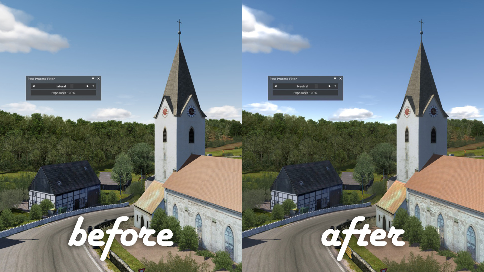
Comparison none Pure
See the difference in the preview comparison none Pure picture (included in the download package):
-sunside of the church is not too bright
-you can see structure in the shadows side of the church tower
-the better contrast of the trees in the background makes them look more natural
-road looks more natural
Comparison Pure
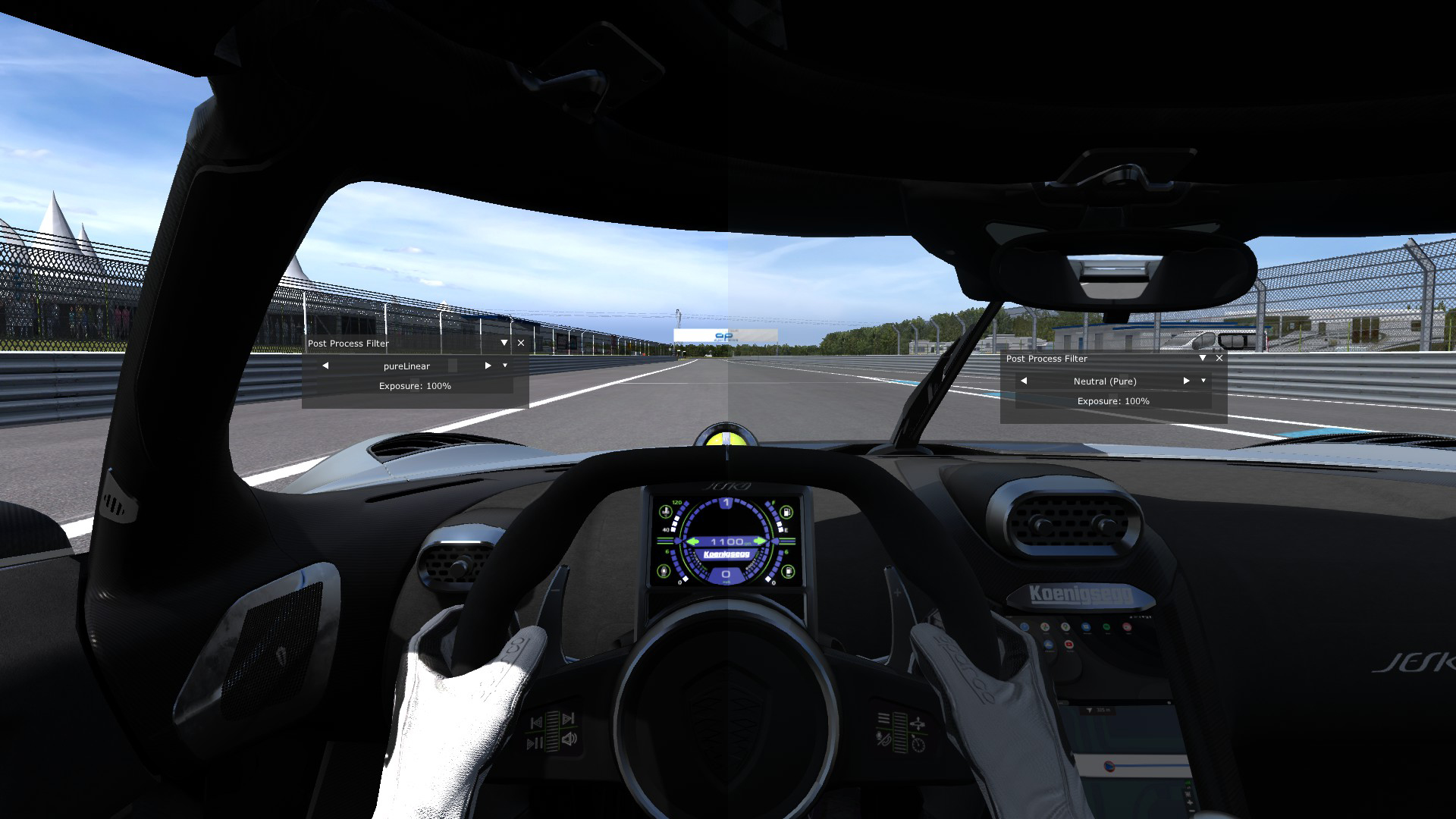
And see the difference in the preview comparison Pure picture (included in the download package):
-the shadows have more structure and are not 100 % black
-the sky has a better contrast
-the Dijon sign in the background is not too bright
-the road looks more smooth
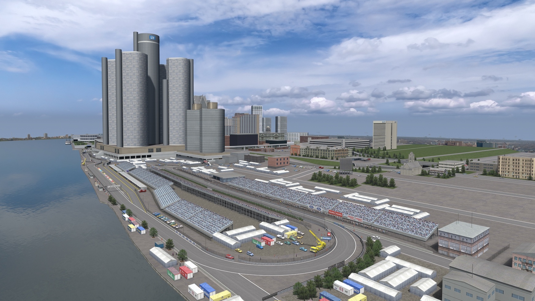
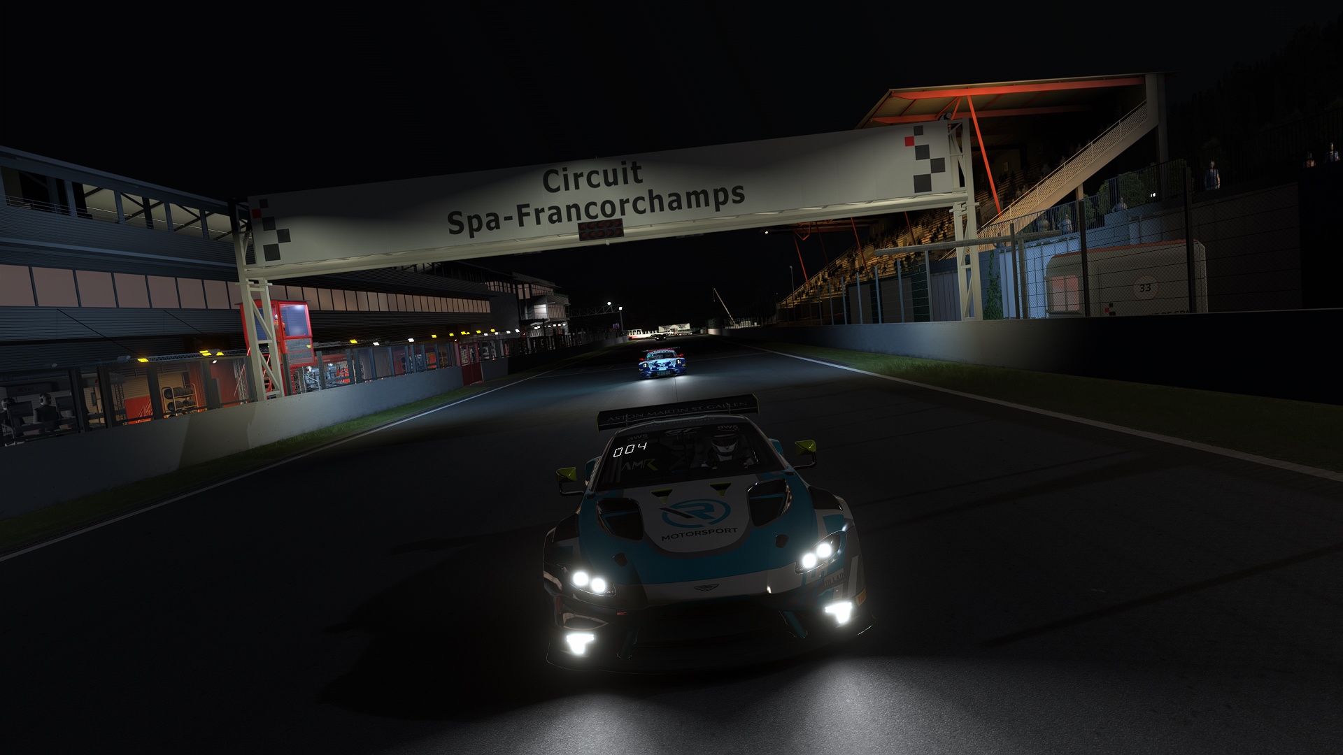
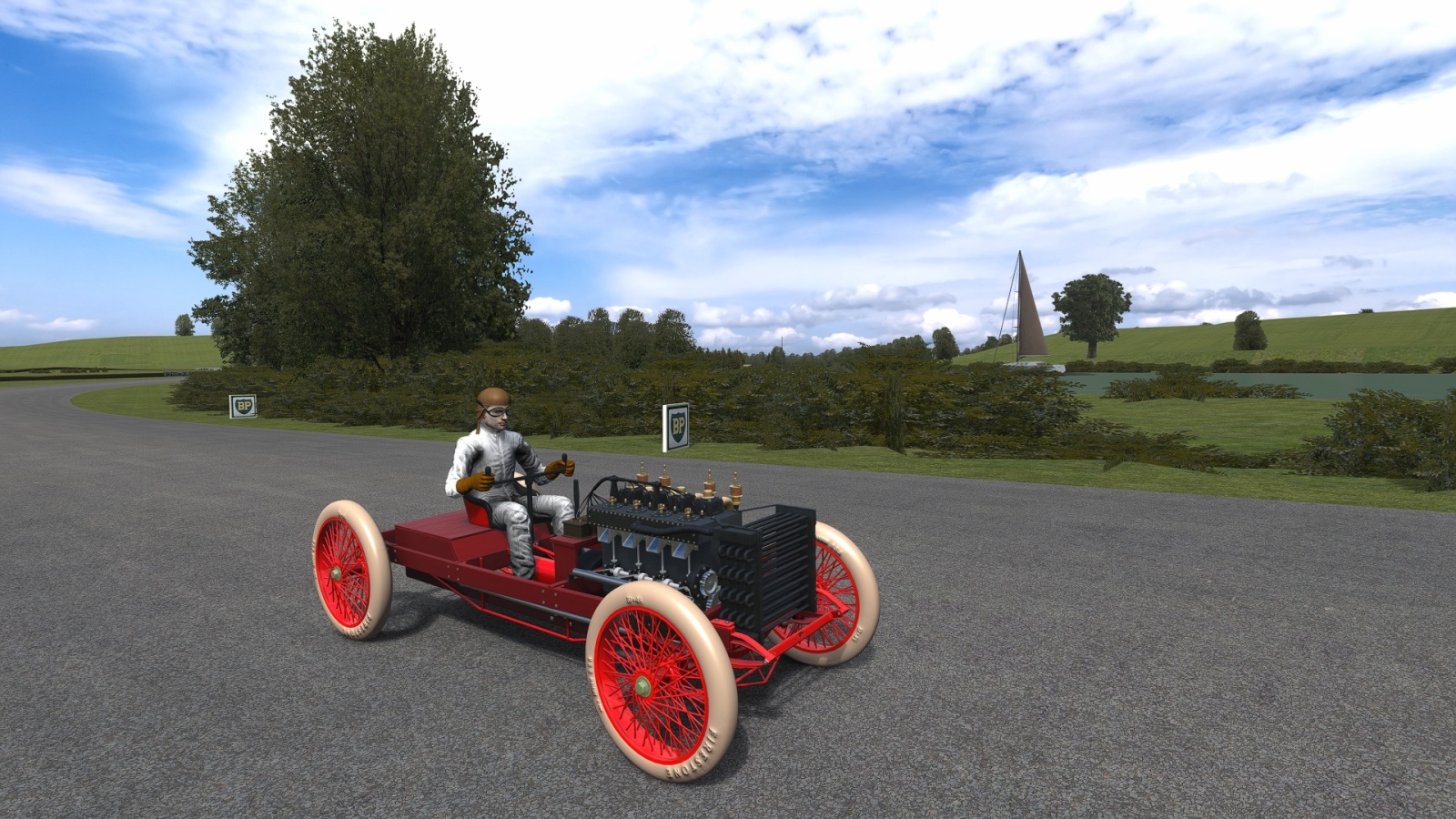
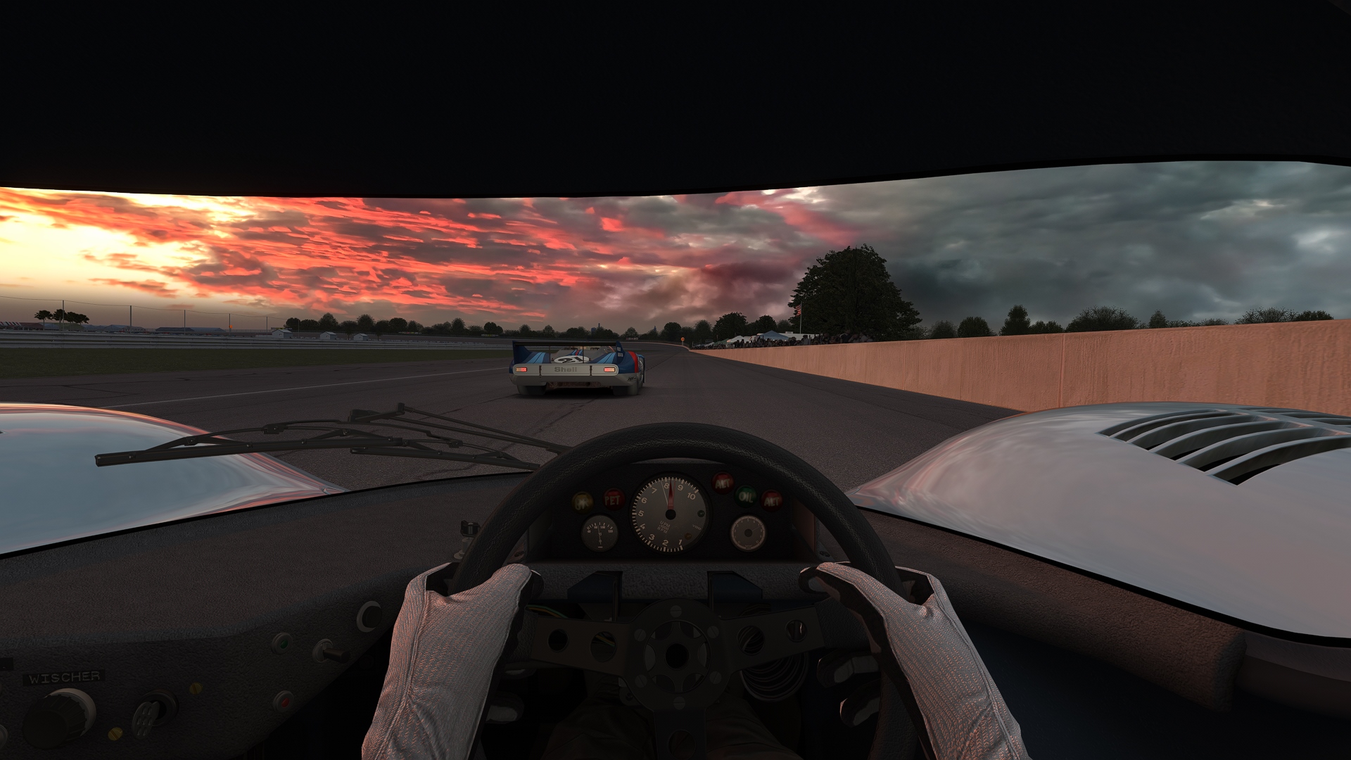
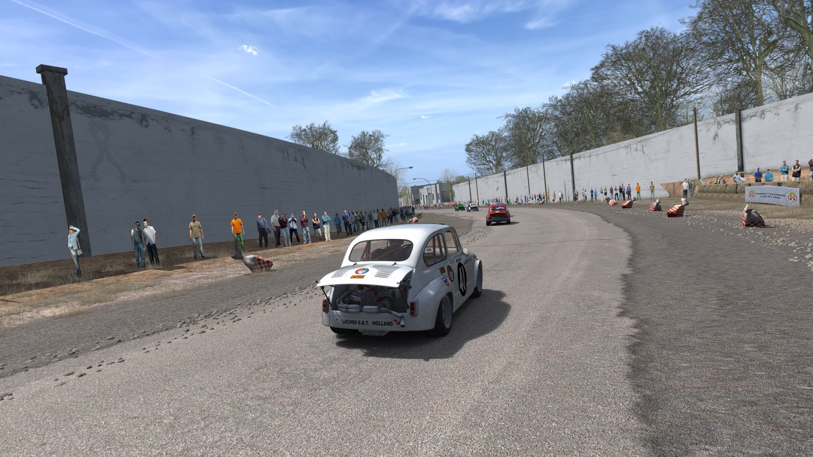
Impressions from the Pure version:
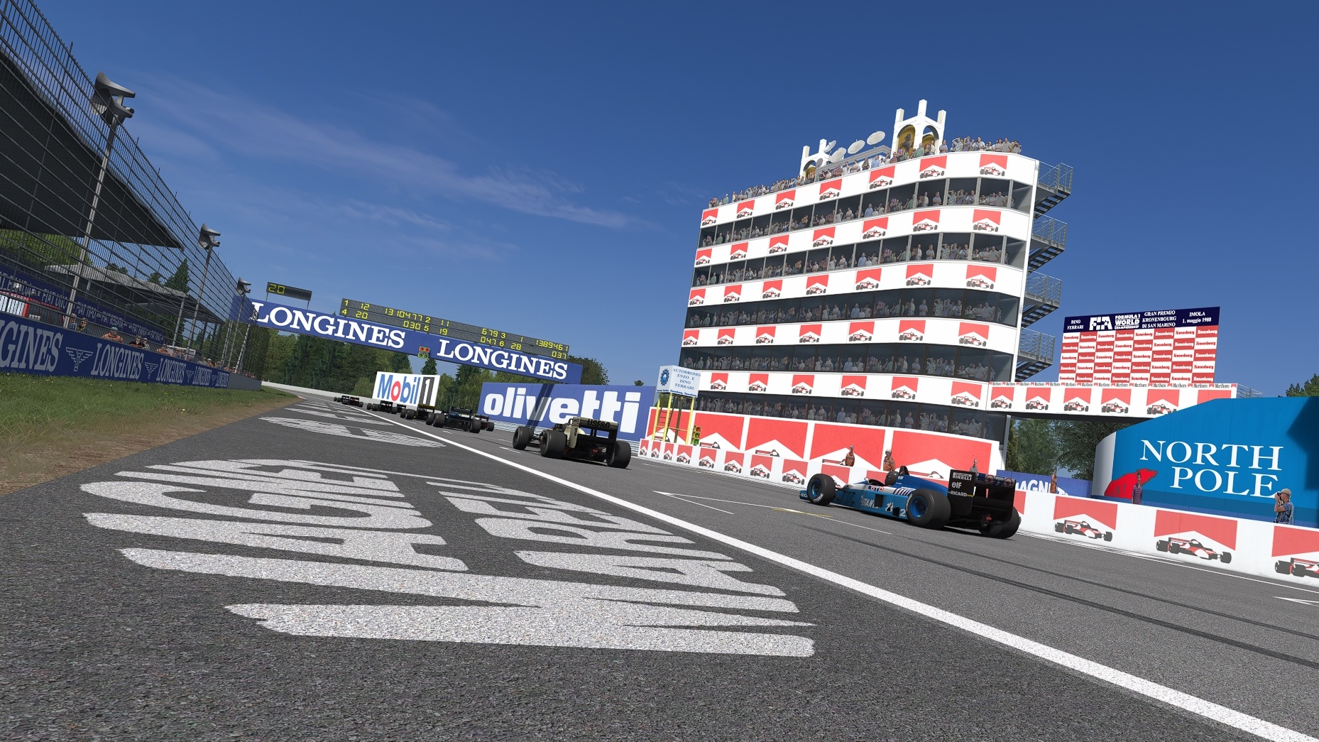
This filter was made to get a optimal color gamut with the knowledge of a professional printer. You will especially see the difference to other filters if you are using a calibrated monitor. The Pure version was developed with friendly help by the Pure author Peter Boese.
This is the filter I'm using for all my track previews.
Features:
-neutral value for color (0.0)
-neutral value for contrast (1.0)
-neutral value for saturation (1.0)
-color temperature 4000 K (neutral white)
-no interrupting auto exposure (none Pure version)
-balanced brightness values created by using a calibrated monitor and checked using Photoshop auto levels
-slightly corrected gamma value for better color gamut of dark areas
Install guide:
Copy the two .ini files into this directory: YOUR-STEAMFOLDER\SteamApps\common\assettocorsa\system\cfg\ppfilters
In game open the "Post Process Filter" app and choose "Neutral" for none CSP, CSP, CSP + SOL and "Neutral (Pure)" if you also use Pure by Peter Boese.
Note for installing the Pure version: After changing the filter with the "Post Process Filter" app, please go out of the session to CM desktop and restart the race. Else it will be too dark!
The Pure pp filter was tested with v0.190 and v0.205 highres. There will be may changes of Pure in the future that will influence the quality of the filter. With this version it is not possible to set up monitor shaders correctly. They will be brighter instead of darker. If you have this error, deactivate the shader with the mirror app.
Comparison none Pure
See the difference in the preview comparison none Pure picture (included in the download package):
-sunside of the church is not too bright
-you can see structure in the shadows side of the church tower
-the better contrast of the trees in the background makes them look more natural
-road looks more natural
Comparison Pure
And see the difference in the preview comparison Pure picture (included in the download package):
-the shadows have more structure and are not 100 % black
-the sky has a better contrast
-the Dijon sign in the background is not too bright
-the road looks more smooth
Impressions from the Pure version:


