Would love some feedback
You are using an out of date browser. It may not display this or other websites correctly.
You should upgrade or use an alternative browser.
You should upgrade or use an alternative browser.
Would love some feedback
Latest reviews
- Matthew327
- 4.00 star(s)
- Version: 1.0
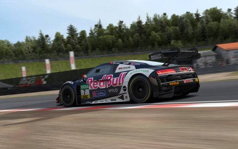
Great job! A few minor points that could be improved on:
- The driver names would typically sit on the chassis above the window, rather than on the window itself
- The shade of blue is a tad too light for Red Bull's current branding
- The car is a bit "bland"; you'd probably see additional sponsors (ByBit, Oracle etc) on areas like the front fenders, the rear bumper, the roof or the hood.
Other than that, I really like it! Definitely adding it to my grid ;)
Latest News
-
Racing Club Schedule: November 3 - 10A new week means a new set of events in our Racing Club. Here's what's on tap from November 3 to...
- Yannik Haustein
- Updated:
- 3 min read
-
Why Motorsport Games Pulled The Plug On The IndyCar GameOriginally planned to be under the Motorsport Games umbrella, the unreleased IndyCar game is not...
- Yannik Haustein
- Updated:
- 4 min read
-
The Group B Class Killer: Tour De Corse Rally Stage In Assetto CorsaThe dynamic, tight and twisty mountain roads of the Tour De Corse rally have been a mainstay of...
- Connor Minniss
- Updated:
- 3 min read
-
2024 Formula One Brazilian Grand PrixAfter arguably the most controversial race weekend of the season so far, Formula One turns to...
- Connor Minniss
- Updated:
- 4 min read
-
NASCAR 25 Dev Diary Shows First In-Engine Glimpse, Laser-Scanned Tracks ConfirmediRacing and Monster Games are developing the upcoming NASCAR 25 and have just released their...
- Luca Munro
- Updated:
- 2 min read
-
Test Drive Unlimited: Solar Crown Players Over Due Financial CompensationTest Drive Unlimited: Solar Crown (TDUSC) has completed yet another maintenance period, and...
- Connor Minniss
- Updated:
- 2 min read
-
List Of Licensed Sim Racing Steering WheelsFrom 1:1 scale GT wheels to Formula One replicas, the world of licensed wheel rims in sim racing...
- Connor Minniss
- Updated:
- 5 min read
- Author
- turtel505
- Downloads
- 213
- File size
- 1.3 MB
- Views
- 2,965
- First release
- Last update
- User rating
- 4.00 star(s) 1 ratings
More mods from turtel505
-
Sintkerklaas | JH Design Formula AgileSintkerklaas skin for JH Design Formula Agile


